
Documentation for LIST-VIEW VID widget
Author: Henrik Mikael Kristensen
Date: 3-Jan-2008
Contents:
IntroductionDemonstration Usage
Creating Lists
Inputting Data
Inputting Data with Objects
Using Columns
Showing Specific Columns
Adding or Removing Columns
Column Sizes
Examples
Setting the Main Column
Using Horizontal Scrolling (Not completed!)
Column Related Variables
data-columns
old-data-columns
viewed-columns
old-viewed-columns
header-columns
resize-column
h-scroll
widths
px-widths
col-widths
fit
row-height
Column Variable Priority
Updating
update
update-pair (Implemented, but not working)
update?
resize
filter-list
set-header-buttons
set-scr
move-edit
place-edit
long-enough
update-speed
Selecting Data
Selection Rules
Selecting From Code
Limitations
Functions and Variables for Selecting
CTX-LIST/HILIGHT-SQUARE
CTX-LIST/HILIGHT-CELL
CTX-LIST/HILIGHT-ROW
CTX-LIST/HILIGHT-COLUMN
CTX-LIST/HILIGHT-HORIZONTAL
CTX-LIST/HILIGHT-VERTICAL
CTX-LIST/QUALIFIERS
CTX-LIST/RANGE
CTX-LIST/COLS
CTX-LIST/ROWS
CTX-LIST/OLD-COL
CTX-LIST/OLD-ROW
select-mode
select-modes
Retrieving Data
over-cell-text
get-row
get-range
range-added
range-removed
get-cell
get-col
get-unique
find-row
limit
set-limit
reset-limit
sorted-data
totals
block-data?
object-data?
Manipulating Data
Manipulating Function Summary
default-object
make-row
insert-row
append-row
append-block
remove-row
remove-block
remove-block-here
change-row
change-cell
move-row
move-selected-row
move-row-up
move-row-down
clear
Filtering Data
Simple Filtering
Advanced Filtering
Optimizations
Limitations on Filtering
Functions and variables for Filtering
filter-string
filter
filter-index
filtering?
reset-filter
filter-spec
filter-row
filter-rows
set-filter
set-filter-spec
remove-filter-spec
reset-filter-specs
Sorting Data
Sorting Examples
Sorting Functions and Variables
sort-column
list-sort
sort-index
sort-direction
tri-state-sort
re-sort
reset-sort
set-sorting
allow-sorting
Sorting Limitations
Navigating the List
cnt
sel-cnt
old-sel-cnt
selected?
col-idx
selected-column
flt-sel-cnt
first-cnt
prev-page-cnt
prev-cnt
next-cnt
next-page-cnt
last-cnt
max-cnt
min-cnt
limit-sel-cnt
reset-sel-cnt
scroll-here
follow
follow?
value-size
lock-list
head-cnt?
tail-cnt?
range
Images
Limitations on Images
Configuration
import
export
Customizing Appearance
colors
spacing
spacing-color
standard-font
standard-para
standard-header-font
standard-header-para
edged-size
button-edge
drag-edge
fonts
paras
truncate
row-face
scroller-width
fill
lst-lo
lst
hdr
scr
hscr
edt
Setting a Custom Row Layout
Header
Inline Editing
Inner Workings
Limitations of Inline Editing
Functions and Variables for Inline Editing
editable?
immediate-edit?
show-edit
submit-edit
hide-edit
last-edit
readonly-columns
editable-columns
Actions
list-action
alt-list-action
doubleclick-list-action
empty-action
alt-empty-action
doubleclick-empty-action
edit-action
tab-edit-action
pre-submit-edit-action
submit-edit-action
cancel-edit-action
refresh-action
over-row-action
drop-action
sort-action
row-action
focus-column
edit-index
edit-value
edit-field
do-action
pre-submit-edit-func
mouse?
keep-selected
Actions Priority List
Optimization
Using UPDATE? to Optimize
On The Fly Changes
Focusing
focus-list
unfocus-list
Drag'n'Drop Operations
Procedure
Limitations
Drag'n'Drop Functions and Variables
redraggable-rows
Debugging
debug-redraw
Error Handling
Error List
VIEWED-COLUMNS contains words missing from DATA-COLUMNS
EDITABLE-COLUMNS contains words missing from DATA-COLUMNS
READONLY-COLUMNS contains words missing from DATA-COLUMNS
HEADER-COLUMNS is longer than VIEWED-COLUMNS
HEADER-COLUMNS is longer than DATA-COLUMNS
Deconstructing LIST-VIEW
LST
HDR
EDT
SCR
Thanks
Some images are either not yet available or may look wrong due to unfinished features.
Some features described may not yet be implemented.
Introduction
The LIST-VIEW VID widget is a powerful extended version of the LIST widget to provide a standardized list view with a range of functions for displaying data and also manipulating them graphically through the list view.
LIST-VIEW supports many different parameters for setting data, fonts, list header, list navigation, filtering, resizing, column output and general behavior, but it's been designed to let you start using a LIST-VIEW widget in your layout code immediately without any configuration.
LIST-VIEW has been released under the BSD License and is currently in version 0.0.52.
History file for this project is available here.
Demonstration Usage
This will be written later.
Creating Lists
To get it:
do http://www.hmkdesign.dk/rebol/list-view/list-view.rThis will load the extension into the VID style. Now you can begin creating complex lists from VID!
A simple example:
view layout [list-view]will open a View window with a list in it.
To use it properly, you need to feed it some data.
Inputting Data
Data are stored in the DATA block either as a block of values, which will be treated as one column of data:
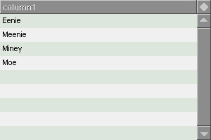
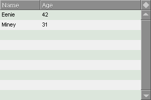
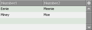
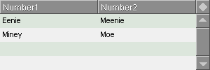
view layout [
  list-view with [
    data: ["Eenie" "Meenie" "Miney" "Moe"]
  ]
]
Or as blocks of blocks if you want multiple columns:
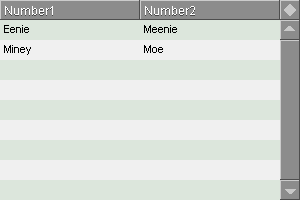
view layout [
  li: list-view with [
    data: [
      ["Eenie" "Meenie"]
      ["Miney" "Moe"]
    ]
  ]
]
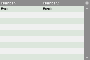
If you've already set up your list, you can insert and remove data using SET-FACE and CLEAR-FACE. When you do that, the list view will be reset to the start position, while other settings, like sorting are retained.
set-face li [["Ernie" "Bernie"]]
Using GET-FACE will return DATA.
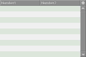
>> get-face li
== [["Ernie" "Bernie"]]
And with CLEAR-FACE, DATA is cleared:
clear-face li
Inputting Data with Objects
You can also use a block of objects. Objects are stored as a 1-dimensional block in DATA.
view layout [
  list-view with [
    data: reduce [
      make object! [name: "Eenie" last-name: "Meenie"]
      make object! [name: "Miney" last-name: "Moe"]
    ]
  ]
]
This method works best if all your objects have the same content structure.
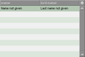
When you store an object in DEFAULT-OBJECT, LIST-VIEW considers this object as the default object and will use that to define which columns are supposed to be used with the objects.
view layout [
  li: list-view with [
    default-object: make object! [
      name: "Name not given"
      last-name: "Last name not given"
    ]
  ]
]
So whenever you are going to append or insert rows with APPEND-ROW or INSERT-ROW, LIST-VIEW will make use of the default object.
li/append-row

Using Columns
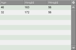
To set the columns, use the DATA-COLUMNS word block:
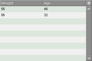
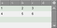
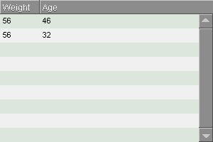
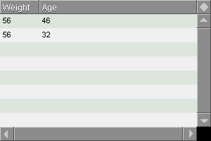
view layout [
  list-view with [
    data-columns: [Age Height Weight]
    data: [
      [46 163 56]
      [32 172 56]
    ]
  ]
]
Note that the columns are now named from words in the DATA-COLUMNS block.
You can use as many columns as you like:
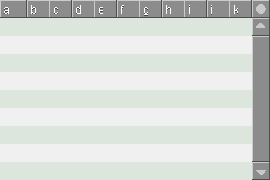
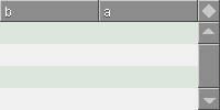
view layout [
  list-view with [
    data-columns: [a b c d e f g h i j k]
  ]
]
Note that the first column is a bit wider. This is because the fitting of columns in the list view solely depends on fitting the column given in RESIZE-COLUMN. There is currently no way to prevent this artifact, when you want to have many small columns and want to fit them automatically to the width of the list.
The solution is to use fixed width columns with pixel values and turn off the FIT flag. More on that in the Column Sizes chapter below.
Showing Specific Columns
By using VIEWED-COLUMNS, you can show specific columns and reorder them without having to manipulate or destroy the contents of DATA. When using VIEWED-COLUMNS, LIST-VIEW can now tell the difference between the columns in DATA.
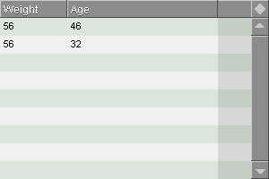
view layout [
  list-view with [
    data-columns: [Age Height Weight]
    viewed-columns: [weight age]
    data: [
      [46 163 56]
      [32 172 56]
    ]
  ]
]
Using this type of column selection only works on blocks of blocks. Attempting to set VIEWED-COLUMNS when using a single block will be ignored.
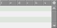
This opens up various possibilities. You can for example sort your columns:
view layout [
  list-view 200x100 with [
    data-columns: [a b c d e f]
    viewed-columns: sort/reverse data-columns
  ]
]
Adding or Removing Columns
With the APPEND-COLUMN, INSERT-COLUMN, UPDATE-COLUMN and REMOVE-COLUMN functions, you can add, update or remove columns to a list view.
When using APPEND-, INSERT-, and REMOVE-COLUMN, these functions directly manipulate DATA. By default when APPENDing or INSERTing, the newly added values are NONE.
These functions do not work on one dimensional DATA blocks.
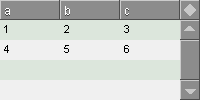
view layout [
  li: list-view 200x100 with [
    data-columns: [a b c]
    data: [[1 2 3][4 5 6]]
  ]
]
li/append-column 'd
Note that when appending columns, a selected row will not reflect the new settings for the number of columns. This means that if you have 4 columns and append a fifth, the last column is not automatically included in the selection. Therefore you need to reselect the row, either in code or by hand. The same goes for insertion.
li/insert-column 2 's
li/remove-column 'c
When removing columns, a selected row will not reflect the new settings for the number of columns. This means that if you have 4 columns and remove one, the excess column is included in the selection. Therefore you need to reselect the row, either in code or by hand.
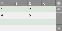
li/update-column 'a 'y
When updating columns, the title of the column as shown in the list, may be separated from the word used in DATA-COLUMNS or VIEWED-COLUMNS in the list specification.


Column Sizes
When not attempting to adjust the size of the columns yourself, LIST-VIEW always tries to both fit the columns within the width of the list and give them the same width as good as it can.
This can be customized with the WIDTHS block. It detects two different datatypes:
integer! The value is a pixel value. decimal! The value is a fraction of the width of the list view. For example a value of 0.5 sets the width of the column to be half of the width of the list view. The width of a column corresponds to the VIEWED-COLUMNS word at the same index.
When using pixel values, it's a good idea to consider the design of the list. Pixel values work best when you want to use a pixel precise list or want to absolutely size a column to fit well-defined content. Pixel width based columns that are not set as RESIZE-COLUMN don't change if you resize the list, where fractional widths do.
RESIZE-COLUMN can be ignored to ensure absolute control over the column widths, by setting the FIT flag to FALSE.
Examples
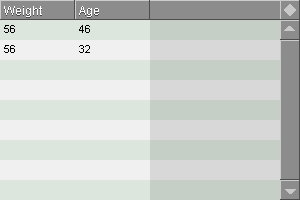
When all column widths are integer! values and FIT is FALSE, no columns are resized automatically. Any "unused" filler area is darker and can't be clicked:
view layout [
  list-view with [
    data-columns: [age height weight]
    viewed-columns: [weight age]
    fit: false
    widths: [75 75]
    data: [
      [46 163 56]
      [32 172 56]
    ]
  ]
]
All widths are calculated in pixels when FIT is FALSE.
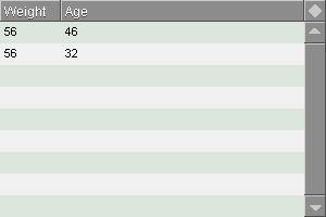
When setting decimal! values, the width is calculated in fractions of the total width. FIT is here TRUE (default), so the width fits perfectly:
view layout [
  list-view with [
    data-columns: [Age Height Weight]
    viewed-columns: [weight age]
    widths: [0.2 0.8]
    data: [
      [46 163 56]
      [32 172 56]
    ]
  ]
]
Nothing prevents you from letting a column exceed the width of the list.
The size of that column will be allowed to exceed the width of the list when it's not set to the RESIZE-COLUMN and when FIT is FALSE.
This doesn't render properly when FIT is TRUE.
view layout [
  list-view with [
    data-columns: [Age Height Weight]
    viewed-columns: [weight age]
    fit: false
    widths: [0.2 1.8]
    data: [
      [46 163 56]
      [32 172 56]
    ]
  ]
]
decimal! and integer! values can freely be mixed:
view layout [
  list-view with [
    data-columns: [Age Height Weight]
    viewed-columns: [weight age]
    fit: false
    widths: [75 0.6]
    data: [
      [46 163 56]
      [32 172 56]
    ]
  ]
]
Setting the Main Column
Examples:
By setting RESIZE-COLUMN to NONE, and FIT to TRUE, the first column will be resized.
Three columns of 60, 40 and 120 pixels with the first adjusted to list width.
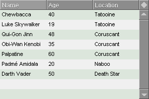
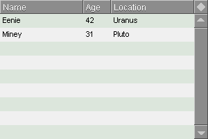
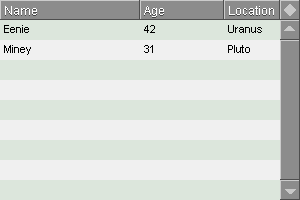
data-columns: [Name Age Location]
widths: [60 40 120]
resize-column: 'name
Same three columns of 60, 40 and 120 pixels with the last adjusted to list width.
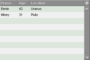
data-columns: [Name Age Location]
widths: [60 40 120]
resize-column: 'location
Three columns at 50%, 30% and 20% of the width of the list. No RESIZE-COLUMN.
data-columns: [Name Age Location]
widths: [0.5 0.3 0.2]
resize-column: none
Two columns, one at 50% of the list, while the other is 200 pixels.
data-columns: [Name Age Location]
widths: [0.5 200]
resize-column: none
Using Horizontal Scrolling (Not completed!)
LIST-VIEW can operate with two different policies, when calculating the widths of the columns:
- H-SCROLL = FALSE - This is the default mode, and LIST-VIEW will attempt to fit the columns within the list. This mode is recommended when you know the combined width of each column does not exceed the width of the list.
- H-SCROLL = TRUE - In this mode, no fitting is attempted, thus RESIZE-COLUMN is ignored. Instead if the combined width of the columns exceed the width of the list view, a scroller at the bottom can be used to navigate the list horizontally. The horizontal scroller is always visible when H-SCROLL is TRUE.
view layout [
  list-view with [
    data-columns: [Age Height Weight]
    h-scroll: true
    data: [
      [46 163 56]
      [32 172 56]
    ]
  ]
]
Column Related Variables
data-columns
Block
Block of words to tell apart the columns in DATA.
old-data-columns
Block (internal)
Previously stored DATA-COLUMNS values. Used internally to track changes in DATA-COLUMNS.
viewed-columns
Block
Block of words to determine the column sequence in the visible list from the DATA-COLUMNS.
old-viewed-columns
Block (internal)
Previously stored VIEWED-COLUMNS values. Used internally to track changes in VIEWED-COLUMNS.
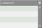
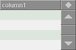
header-columns
Block (internal)
Block of words or strings that are listed in the header of the list. If the list is set to empty, the header is not drawn. If HEADER-COLUMNS is set to a single value, it will automatically spread the header to the entire width of the list view.
Examples
view layout [
  list-view 200x100 with [
    data-columns: [a b c]
    viewed-columns: [b a]
    header-columns: ["B" "A"]
  ]
]
view layout [
  list-view 200x100 with [
    data-columns: [a b c]
    viewed-columns: [b a]
  ]
]
view layout [
  list-view 200x100 with [
    data-columns: [a b c]
    viewed-columns: [b a]
    header-columns: []
  ]
]

resize-column
Word
Word with column that should be resizable, when using FIT. If set to NONE, no specific column is resized.
h-scroll
Flag
Defines with TRUE/FALSE whether or not to use horizontal scrolling.
widths
Block
A block of either integer! or decimal! numbers. If integer! is used for a number, it will be interpreted as a pixel value. If decimal! is used for a number, it will be interpreted as a fractional value of the total width of the list minus the scroller width. See chapter Column Widths below.
px-widths
Block (internal)
A block of pixel values calculated from the values in WIDTHS, used internally to set the widths of the columns. Don't use this directly, as it's overwritten when using UPDATE very often.
col-widths
Block (internal)
Integer of the sum of all integers in PX-WIDTHS before it's adjusted using RESIZE-COLUMN if the FIT flag is TRUE. Used internally to calculate the difference offset between the far right of the list view minus SCROLLER-WIDTH and the right edge of the last column in the list.
fit
Flag
true Determines the width of the column given in RESIZE-COLUMN so that the entire list fits within the width of the listframe between the left edge of the list view and the left edge of the vertical scrollbar in the right side, false No attempts made to fit the width of the columns. This is useful if you want to force specific pixel values into the list, if you are using a custom ROW-FACE.
row-height
Integer
Alters the height of a row in pixels when not using ROW-FACE. This can be useful if you need large fonts or multiple lines per row. (integer)
Example
view layout [
  list-view with [
    row-height: 40
    data: ["Really" "Big" "Rows"]
  ]
]
Column Variable Priority
LIST-VIEW handles leaving out any of HEADER-COLUMNS, DATA-COLUMNS and VIEWED-COLUMNS, so that something can always be displayed with a meaningful result.
Scenario
Result
No DATA-COLUMNS
LIST-VIEW takes the first row of data in DATA and uses that for column names. Since DATA can contain number!, column names can't be directly applied. Therefore a conversion takes place so that number! columns are written as "Number".
Note that there is still not a way for LIST-VIEW to handle any kind of type, only string! and number!.
No VIEWED-COLUMNS
LIST-VIEW copies DATA-COLUMNS and uses that for column names.
No DATA-COLUMNS but VIEWED-COLUMNS
VIEWED-COLUMNS is ignored and it will do the same as if there were no DATA-COLUMNS.
No HEADER-COLUMNS but VIEWED-COLUMNS
The header names are then taken from VIEWED-COLUMNS.
No HEADER-COLUMNS but DATA-COLUMNS
The header names are then taken from DATA-COLUMNS.
No DATA
LIST-VIEW will always assume a multi-column list, and use a block of blocks as rows, even if there is only one column.
Data values can be anything that can be converted to text, which is done when displaying the data for each cell.
Like any other VID element, you can set the data after creating the layout.
Updating
update
Function
Updates the list, when inputting new values. This should be used always when updating LIST-VIEW.
/force Will force a deeper update and completely redraw the list. Use only when necessary as it's more time consuming and may cause flickering. Note that this function actually ignores the contents of UPDATE?, even when /force is not used.
update-pair (Implemented, but not working)
Function
Updates two rows in the list. This is used internally in many operations where two rows need to be visibly updated, such as when selecting a new row, swapping rows and other operations.
This is useful for performance reasons, but it only works if both rows are visible at the same time.
from The first row that needs to be updated. to The second row that needs to be updated. The order of from and to is not important.
update?
Flag
When set to TRUE, list select cursor movements and list manipulation operations are visible. When set to FALSE, they are not. This is useful for sequences of manipulations, which prevents the list from updating after each manipulation. The result is so that the list can be updated much faster, by only updating the list when UPDATE? is set to TRUE again. This is for example used by the MOVE-ROW-UP and MOVE-ROW-DOWN functions.
Example
Let's say you want to move your list cursor three rows down in your list-view called LV:
lv/update?: false
lv/next-cnt
lv/next-cnt
lv/update?: true
lv/next-cnt
Setting UPDATE? to TRUE just before the last NEXT-CNT will automatically update the list again at the desired position when the final NEXT-CNT is run.
resize
Function
Resizes and redraws the list.
size New size to resize the list to. (pair) Example
view layout [
  lv: list-view 200x100
]
lv/resize 300x120
filter-list
Function
Function used internally to create the filtered and sorted index, SORT-INDEX. It's called during UPDATE, and should not be necessary for you to use.
/single Will only update a single row in the list. This is useful if you want to update only one row at a time, as this increases update performance on large lists greatly. (it is also not yet working)
pos Specify row to update. This row is calculated from GET-ID. When UPDATE? is set to FALSE, this function doesn't produce a visible result.
set-header-buttons
Function
Function used internally to redraw the header buttons.
When UPDATE? is set to FALSE, this function doesn't produce a visible result.
set-scr
Function
Function used internally to redrag and place the vertical scroller in the list.
When UPDATE? is set to FALSE, this function doesn't produce a visible result.
move-edit
Function (internal)
Moves the inline edit fields when using the scroller.
Function (internal)
place-edit
Function (internal)
Places the inline edit fields at the right Y position.
long-enough
Function (internal)
Sets how long there should be between SHOWs, thereby adjusting the frame rate of scrolling. This helps avoiding most event drowning scenarios, which happen if your mouse is sampling faster than the update rate of the list, while scrolling. Event drowning causes scrolling to slow down to a crawl.
update-speed
Time (internal)
Time! value which stores the interval between updates of the list. Used internally by LONG-ENOUGH.
Selecting Data
LIST-VIEW offers 7 different methods for selecting in the list, using the SELECT-MODE variable:
single Select single cells in your list. single-row Select single rows in your list. This is the default mode. multi Select multiple cells arbitrarily in your list, using Shift and Control keys. multi-row Select multiple rows arbitrarily in your list, using Shift and Control keys. This could be the best used mode for you. column Select multiple columns arbitrarily in your list, using Shift and Control keys. horizontal Select multiple cells in sequential order horizontally from left to right, row by row using the Shift key. vertical Same as HORIZONTAL except the principle is turned 90 degrees clockwise. Through the use of the CTX-LIST object, ranges of cells, rows or columns can be selected and stored in CTX-LIST/RANGE as pairs. Under LIST-VIEW, CTX-LIST is instantiated as CONTEXT-LIST. There is one CTX-LIST object per LIST-VIEW.
By using the Shift or the Control key, you can select multiple cells:
Shift will let you select a range of cells, rows or columns, depending on the select mode. Control will let you select and deselect single cells, rows or columns, depending on the select mode.
Selection Rules
Some rules apply to selecting:
- When both keys are pressed, they cancel eachother out, as if they were not pressed.
- When selecting, the first selected cell, row or column is maintained as the first selected, when selecting the ending cell, row or column with Shift. They will "revolve" around the first selected.
- When selecting a cell, row or column with Shift and thereafter deselecting one of those cells, rows or columns with Control, the original Shift selected first cell, row or column is reset. When selecting a new cell, row or column after this, CONTEXT-LIST/RANGE will be emptied for allowing a new selection.
- The selection mechanism with Control and Shift is copied from the MacOSX Finder.
- When the list is rendered, it uses the pairs stored in CONTEXT-LIST/RANGE to paint the selected cells darker. This is done so that it will paint the correct cells, even if you are filtering or sorting.
- When sorting or filtering, the select modes behave as if the list was neither sorted or filtered. Thus if you select a square area while filtering, it will appear as a square, but if the filter is removed, the cells will spread out accordingly, but stay selected.
Selecting From Code
If you want to select cells, rows or columns from within your code, you need to either manipulate CONTEXT-LIST/RANGE directly or use the HILIGHT-CELL, HILIGHT-ROW or HILIGHT-COLUMN function from CONTEXT-LIST.
You must simulate the situation where a user selects the requires cells, e.g. first select the first cell, then select the last cell with indication of qualifier keys.
Note that these functions are independent from the SELECT-MODE chosen in LIST-VIEW.
Example
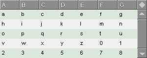
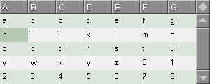
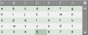
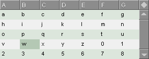
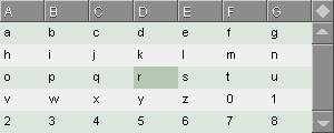
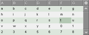
view layout [
  lv: list-view 300x120 with [
    data-columns: [A B C D E F G]
    data: [
      [a b c d e f g]
      [h i j k l m n]
      [o p q r s t u]
      [v w x y z 0 1]
      [2 3 4 5 6 7 8]
    ]
  ]
]
First selection:
lv/context-list/hilight-cell 1 2
The the second selection:
lv/context-list/hilight-cell/shift 4 5
As CTX-LIST only accepts direct integers, it's appropriate to use translate this, so filtering and sorting can be taken into account:
lv/context-list/hilight-cell
  lv/col-idx 'b ; Column B
  pick lv/sort-index 4 ; Fourth Row
Let's select another cell, but this time use the HORIZONTAL selection mode:
lv/context-list/hilight-horizontal/shift
  lv/col-idx 'd
  pick lv/sort-index 3
We can change the selection to VERTICAL:
lv/context-list/hilight-vertical/shift
  lv/col-idx 'd
  pick lv/sort-index 3
Now lets select 3 unrelated cells with a simulated Control key:
lv/context-list/hilight-cell 2 2
lv/context-list/hilight-cell/control 4 4
lv/context-list/hilight-cell/control 6 3


Limitations
It's currently not possible to drag-select cells, rows or columns.
Functions and Variables for Selecting
These functions and variables are tied to the CTX-LIST object.
CTX-LIST/HILIGHT-SQUARE
This highlights a square area of cells with the use of OLD-ROW and OLD-COL as the start corner. Used internally by the other highlighting functions.
col The column to select the end corner cell in (integer) row The row to select the end corner cell in (integer)
CTX-LIST/HILIGHT-CELL
This highlights either a single cell, multiple arbitrary cells (with Control modifier) or a square portion of cells (with Shift modifier).
col The column to select the cell in (integer) row The row to select the cell in (integer) /shift Will simulate the use of the Shift key. /control Will simulate the use of the Control key.
CTX-LIST/HILIGHT-ROW
Highlights a full row in the list.
row The row number to select the row in (integer) /shift Will simulate the use of the Shift key. /control Will simulate the use of the Control key.
CTX-LIST/HILIGHT-COLUMN
col The column number to select the column in (integer) /shift Will simulate the use of the Shift key. /control Will simulate the use of the Control key.
CTX-LIST/HILIGHT-HORIZONTAL
Highlights cells horizontally going right and down, progressively.
row The row number to select the row in (integer) col The column number to select the column in (integer) /shift Will simulate the use of the Shift key. /control Will simulate the use of the Control key.
CTX-LIST/HILIGHT-VERTICAL
Highlights cells vertically going down and right, progressively.
row The row number to select the row in (integer) col The column number to select the column in (integer) /shift Will simulate the use of the Shift key. /control Will simulate the use of the Control key.
CTX-LIST/QUALIFIERS
A block, consisting of words 'shift and/or 'control to indicate which keys are supposed to be pressed. This is used internally by LIST-TEXT. (block)
CTX-LIST/RANGE
This is a block with pair! values representing the cells that have been selected. The selection is always represented per cell, so you can inspect each and every one. This is done internally to paint the selected cells correctly. (block)
CTX-LIST/COLS
The number of visible columns in the list. (integer)
CTX-LIST/ROWS
The number of visible rows in the list. (integer)
CTX-LIST/OLD-COL
The first selected column number in the list. (integer)
CTX-LIST/OLD-ROW
The first selected row number in the list. (integer)
These functions are directly stored in LIST-VIEW:
select-mode
Word
Word with chosen select-mode. This word can be one of these:
single Allows selecting single cells. Does not respond to qualifier keys. row Allows selecting single rows. Does not respond to qualifier keys. multi Allows selecting multiple cells with the Shift or Control key. multi-row Allows selecting multiple rows with the Shift or Control key. column Selects one or more whole columns with the Shift or Control key. horizontal Selects horizontally cells from the left to the right, downward between the start and end cells. vertical Selects vertically cells downward and to the right between the start cell and end cell
select-modes
Block
Contains the above mentioned select modes as words.
Retrieving Data
over-cell-text
Function
Returns the current cell text that the mouse is over as a string! value.
get-row
Function
Returns a row of DATA at the selected position, unless refinements are used.
/over Returns the row that is over the mouse. Is useful in combination with OVER-ROW-ACTION. /here Will return a row at pos (integer), taking in account for filtering and sorting.
pos The position from which to get a row. (integer)
/raw Will return a row at rpos (integer) from the raw DATA, without filtering or sorting. The /raw refinement overrides the /here refinement
rpos The position from which to get a row. (integer)
/keys Returns the row as a keyed block, with the words used in data-columns as keys. Example:
>> li/get-row/keys
== [first-name "Luke" last-name "Lakeswimmer"]
get-range
Function
Gets a block of values from the CONTEXT-LIST/RANGE block by picking them from DATA. This works in all SELECT-MODEs.
GET-RANGE is very flexible at getting blocks of data from selections, since data can be selected almost arbitrarily. Therefore GET-RANGE is currently not easily suited for getting data that needs to be changed at those positions.
GET-RANGE outputs data in two ways, depending on the modes:
Horizontal and vertical
For HORIZONTAL and VERTICAL mode the value is returned as a single block in the order as represented in DATA.
So if you have selected 12 cells in a 7 column list: 3 in one row, 7 in the next and 2 in the third row, the 12 cells will be returned in order from left to right.
For VERTICAL, this is the same, only the selection is turned 90 degrees clockwise.
Single, Single-row, Multi, Multi-row, Column
For the remaining types, SINGLE, SINGLE-ROW, MULTI, MULTI-ROW and COLUMN, the values are returned as block of blocks similar to the standard format for DATA, but each sub-block has the size of the number of cells selected for a particular row.
So if you have selected 5 cells, 3 in one row, and 2 in the next, the returned value will look like:
[[a b c][d e]]
/flat Gets data as a flat continous block. Examples
Since we can't do actual mouse based selection in this document, I can't give examples on how the select modes actually work with GET-RANGE. Instead I'll use the highlighting functions directly.
To demonstrate GET-RANGE using mouse based selection, try Demo 11 in the demo list.
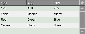
First we create a list with some data:
view layout [
  lv: list-view 300x120 with [
    data: [
      ["123" "456" "789"]
      ["Eenie" "Meenie" "Miney"]
      ["Red" "Green" "Blue"]
      ["Yellow" "Black" "Brown"]
    ]
  ]
]
Selecting a single cell will return a single entry in a block in a block:
>> lv/context-list/hilight-cell 2 2
>> lv/get-range
== [["Meenie"]]
Selecting arbitrary cells will return a block of the cells in the same order as they have been selected.
>> lv/context-list/hilight-cell 3 1
>> lv/context-list/hilight-cell/control 2 2
>> lv/context-list/hilight-cell/control 1 3
>> lv/get-rance
== [["789"]["Meenie"]["Red"]]
Selecting a full row will return a block in a block:
>> lv/context-list/hilight-row 1
>> lv/get-range
== [["123" "456" "789"]]
When selecting a square area, you get multiple blocks in a block. This counts both for squares that don't take up the entire width of the list and squares that do:
>> lv/context-list/hilight-cell 2 1
>> lv/context-list/hilight-cell/shift 3 3
>> lv/get-range
== [["456" "789"]["Meenie" "Miney"]["Green" "Blue"]]
When selecting a column, you get blocks with single entries.
>> lv/context-list/hilight-column 3
>> lv/get-range
== [["789"]["Miney"]["Blue"]["Brown"]]
When using the /flat refinement, you can return a single block:
>> lv/get-range/flat
== ["789" "Miney" "Blue" "Brown"]


range-added
Function
This function returns the range added to the CTX-LIST/RANGE, thereby showing you precisely which cells were added since the last selection. If no cells were added, the returned block is empty. The returned indices is either a single block of pairs for 1-dimensional data or object data or a block of blocks of pairs for 2-dimensional data.
It is entirely the opposite function of RANGE-REMOVED.
Example
Let's say you have a list with 2 columns and 3 rows in DATA without a selection.
Then you select row 2 and 2 cells (one row) in the list will be selected. When calling RANGE-ADDED, the following will be returned:
[[1x2 2x2]]If you then select row 3, row 2 is deselected and row 3 is selected:
[[1x3 2x3]]
range-removed
Function
This function returns the range removed from the CTX-LIST/RANGE, thereby showing you precisely which cells were removed since the last selection. If no cells were removed, the returned block is empty. The returned indices is either a single block of pairs for 1-dimensional data or object data or a block of blocks of pairs for 2-dimensional data.
It is entirely the opposite function of RANGE-ADDED.
If you select multiple rows, all rows will of course be shown in the result. If you deselect a row from a multiple row selection
Example
Let's say you have a list with 2 columns and 3 rows in DATA without a selection.
Then you select row 2. When calling GET-RANGE-REMOVED, an empty block is returned, because nothing was deselected when you clicked on row 2:
[]If you then select row 3, row 2 is deselected and row 3 is selected. The deselected row is returned:
[[1x2 2x2]]If you deselect multiple rows, all those rows will of course be shown in the result.
get-cell
Function
Returns a cell from a row in DATA at the selected position by the word, unless refinements are used.
/over Returns the cell that is over the mouse. Is useful in combination with OVER-ROW-ACTION. pos (integer) word Name from DATA-COLUMNS of the column /here Will return a cell at pos (integer), taking in account for filtering and sorting.
pos The position from which to get a cell. (integer)
/raw Will return a cell at rpos (integer) from the raw DATA, without filtering or sorting. The /raw refinement overrides the /here refinement
rpos The position from which to get a cell. (integer)
get-col
Function
Returns a block with all values of a single column.
column The column to return (word)
get-unique
Function
Returns a block with the unique values of a single column.
column The column to return (word)
find-row
Function
Returns the first row in DATA that contains the value that was searched for and selects the row. If not found, NONE is returned. All columns are searched by default.
value Value to find in DATA. If a block! is given, this will be interpreted as a full row to search for. If anything other than block! is given, the value is searched for in a single cell. /col Specify which column to search in. When this is enabled, the value can be of any type, including block!. Examples
layout [
  lv: list-view [
    data-columns: [name age]
    data: [
      ["James" 57]
      ["John" 21]
      ["Jim" 34]
    ]
  ]
]

>> lv/first-cnt

>> lv/find-row ["John" 21]
== ["John" 21]
If the row does not exist, NONE is returned and the selected value remains:
>> lv/find-row ["Jack" 35]
== none
You can also specify a single value to search per cell:
>>lv/find-row "John"
== ["John" 21]
You can as of this time not search for partial strings
If specifying /col, you can limit to a specific column:
>> lv/find-row/col "Jim" 'name
== ["Jim" 34]
Again if the row you are searching for isn't found, NONE is returned.
limit
Integer or None
If set, the output will be limited to the number set in LIMIT. If set to NONE, the output will be of the full length. This works regardless of filtering.
This is useful to build a top 3, top 10 or similar kind of list.
set-limit
Function
This sets LIMIT, updates the list view, and scrolls the view to the first entry in the list.
Example
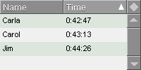
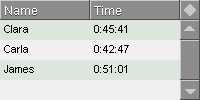
Store a list of race results and show the first three:
view layout [
  results: list-view 200x100 with [
    data-columns: [Name Time]
    data: [
      ["Clara" 0:45:41]
      ["Carla" 0:42:47]
      ["James" 0:51:1]
      ["Carrie" 0:47:33]
      ["Carol" 0:43:13]
      ["Jim" 0:44:26]
    ]
  ]
]

results/set-limit 3
Appropriately, the three fastest should be shown:
results/sort-direction: 'asc
results/sort-column: 'time
results/update
reset-limit
Function
This resets LIMIT and updates the list view.
sorted-data
Function
This function outputs DATA in the same format, but sorted and filtered according to current sorting and filtering settings.
totals
Function
Returns a pair! value with the first value being the number of rows shown in the list and the second being the total number of rows in the list.
Example
>> totals: lv/totals
>> reform [totals/1 "of" totals/2 "rows are shown"]
== "7 of 12 rows are shown"
block-data?
Function
Returns TRUE if DATA is a block of blocks or if DATA contains objects. If it's a block of other elements than blocks or objects, then FALSE is returned. Used internally in many places.
object-data?
Function
Returns TRUE if DEFAULT-OBJECT is an object or if DEFAULT-OBJECT is a function. If DEFAULT-OBJECT is NOONE, then returns TRUE if DATA is a block of objects, but not if DATA just contains blocks. This is an important separation from BLOCK-DATA?.
It's assumed that if DEFAULT-OBJECT is a function, it will return an object. This is to avoid evaluating the function and slowing down OBJECT-DATA?, as it's called many times in LIST-VIEW.
Manipulating Data
LIST-VIEW can manipulate data in the DATA block and show the results immediately in the list view, using just one function. The functions work similarly to those of REBOL's own APPEND, INSERT and CHANGE functions with a few bits added.
All the manipulation functions automatically updates the list.
view layout [
  lv: list-view with [
    data: [
      ["a" "b"]
      ["c" "d"]
      ["f" "g"]
    ]
  ]
]
When you want to add a row, simply use APPEND-ROW. APPEND-ROW will add an empty row to DATA, place the select cursor on the added row and redisplay the list view:
lv/append-rowBy using the /values refinement, you can provide a value to append to DATA:
lv/append-row/values 127or a block of values to insert into that row, if DATA is a block of blocks:
lv/append-row/values ["value1" "value2"]You can from version 0.0.16 also use a keyed block, which is useful, if you want to insert data from a GET-FACE operation on a panel of text fields or from an object. Note that the keys will not be used to determine the columns, but are just ignored. (This may change later)
lv/append-row/values [potatoes: "value1" carrots: "value2"]From version 0.0.22, INSERT-ROW can now also be used on empty DATA.
From version 0.0.24, all manipulation functions will start at the first row, if SELECTED? is NONE
Using the manipulation functions work directly on DATA, not on the data in the sorted list view. The list will always automatically be resorted when DATA is updated with one of these functions.
To change a row, use the CHANGE-ROW functions:
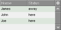
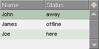
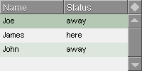
view layout [
  buddies: list-view 200x100 with [
    data-columns: [Name Status]
    data: [
      ["James" away]
      ["John" here]
      ["Joe" here]
    ]
  ]
]
buddies/change-row 1 ["James" offline]
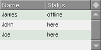
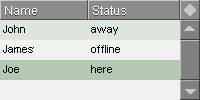
Let's say you want to change the row with "Joe" in it, but you don't know where it is. You can then use FIND-ROW to find it. FIND-ROW will find the first instance of a given row or cell value in DATA. When the value has been found, the row will be selected, so you can perform operations on it.
buddies/find-row ["Joe" here]
buddies/find-row "Joe"
Using the /col refinement, will let you search for a value in a specific column.
buddies/find-row/col "John" 'name
If the row isn't found, no selection is made or changed from the current selection.
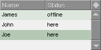
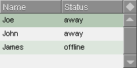
You can use the /top refinement to update, say, an activity list, without storing a timestamp and using sorting. This means that every time you change a row, the row will then be moved to the top of DATA, pushing other values down.
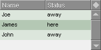
The selected position stays on the changed row, so when we need to edit a new row, we need to select it first. We did that by searching for the needed name "John".
buddies/change-row/top ["John" away]
buddies/find-row/col "Joe" 'name
buddies/change-row/top ["Joe" away]
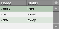
buddies/find-row/col "James" 'name
buddies/change-row/top ["James" here]
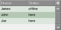
FIND-ROW actually returns the row that was found. Then you can do the following:
buddies/change-row/top buddies/find-row/col "Joe" 'nameTo move the row to the top of the list, without changing it.
For even easier manipulation of single values in the list, use CHANGE-CELL. This allows you to change one value in DATA, just by giving the row and the column.
Since CHANGE-CELL also supports the /top refinement, we can do the operations shown above, but reducing what we need to change to a single value:
buddies/find-row/col "James" 'name
buddies/change-cell 'status 'here

Manipulating Function Summary
default-object
Object
When DEFAULT-OBJECT is set to an object, LIST-VIEW will always create elements for DATA with DEFAULT-OBJECT. It makes a new object on each insertion.
When set to NONE, DEFAULT-OBJECT is ignored.
make-row
Function (internal)
Creates an appropriate row for a list.
insert-row
Function
Inserts a row in DATA at the selected position, unless refinements are used. Note that if DATA is an empty block, the value will be inserted regardless of the value of pos.
pos Position in DATA to insert data in. (integer) /values Block to insert in DATA
vals Value (block or single value)
/here Will insert a row at pos (integer), taking in account for filtering and sorting.
pos The position from which to insert a row. (integer)
/raw Will insert a row at rpos (integer) from the raw DATA, without filtering or sorting. The /raw refinement overrides the /here refinement
rpos The position from which to insert a row. (integer)
/act Do LIST-ACTION after inserting a row. /keys Insert a row as a key/value set. This way, you can set only specific values in a row, while the remaining values will be NONE. The values will be stored in DATA without the keys. Example:
li/insert-row/keys [first-name "Luke" last-name "Lake-swimmer"]When DEFAULT-OBJECT is an object, INSERT-ROW uses DEFAULT-OBJECT with default values for insertion. It does a:
make default-object []on DEFAULT-OBJECT and inserts that into DATA.
When UPDATE? is set to FALSE, this function doesn't produce a visible result.
append-row
Function
Appends a row in DATA. Returns the added row.
/values Block to append to DATA (block) If this refinement is left out, an empty row is added.
vals Value (block or single value)
/no-select Will avoid selecting the appended row. /act Do LIST-ACTION after appending a row. /keys Append a row as a key/value set. This way, you can set only specific values in a row, while the remaining values will be NONE. The values will be stored in DATA without the keys. Example:
li/append-row/keys [first-name "Luke" last-name "Lake-swimmer"]/keys has no effect, when using object based lists.
When DEFAULT-OBJECT is an object, APPEND-ROW uses DEFAULT-OBJECT with default values for insertion. It does a:
make default-object []on DEFAULT-OBJECT and appends that to DATA.
When UPDATE? is set to FALSE, this function doesn't produce a visible result.
append-block
Function
Appends a block of data in DATA. The data should be a block in the same format as the block in DATA. (NOT TESTED)
When UPDATE? is set to FALSE, this function doesn't produce a visible result.
remove-row
Function
Removes a row at the selected position, unless refinements are used.
/here Will remove a row at pos (integer), taking in account for filtering and sorting.
pos The position from which to remove a row. (integer)
/raw Will remove a row at rpos (integer) from the raw DATA, without filtering or sorting. The /raw refinement overrides the /here refinement
rpos The position from which to remove a row. (integer)
/no-select Will set SEL-CNT to NONE afterwords, so no row is selected. Without this refinement, a row is always selected using LIMIT-SEL-CNT. /act Do LIST-ACTION after removing a row. When no row is selected, the function does nothing.
When UPDATE? is set to FALSE, this function doesn't produce a visible result.
remove-block
Function
Removes a block from pos with range. The data removed is based on SORT-INDEX, so it will remove a coherent chunk based on the current sort mode and filtering. (NOT TESTED)
pos Start position (integer) range Length (integer)
remove-block-here
Function
Removes a block from the selected position to range. (NOT TESTED)
range Length (integer)
change-row
Function
Changes a row (block) at the selected position, unless refinements are used. Returns the changed row.
value Row in DATA to change (block) /here Will change a row at pos (integer), taking in account for filtering and sorting.
pos The position from which to change a row. (integer)
/raw Will change a row at rpos (integer) from the raw DATA, without filtering or sorting. The /raw refinement overrides the /here refinement
rpos The position from which to change a row. (integer)
/top After changing the row, the row is moved to the top of DATA, which can be useful for lists where changes must be illustrated, for example to see the last changed of a list without needing to sort by a timestamp column. When using sorting, this refinement is not visible until using RESET-SORT. /act Do LIST-ACTION after changing a row. TODO: When DEFAULT-OBJECT is an object, CHANGE-ROW changes the object values.
When UPDATE? is set to FALSE, this function doesn't produce a visible result.
change-cell
Function
CHANGE-CELL works in two ways:
SINGLE-ROW select-mode Changes a cell given by word at the selected position, unless refinements are used. Returns the changed row. All other types of select-modes Changes all cells given by word at all selected positions in RANGE. The change happens by selecting all positions in RANGE, filter out the rows as given in the list (NOT in DATA!) and change those positions. Therefore the refinements /here and /raw are ignored.. This means that CHANGE-CELL only changes the row once for a specific column, not arbitrarily selected cells. Returns nothing. value New block to insert (block) /here Will change a row at pos (integer), taking in account for filtering and sorting. /obj Will change a cell that holds an object. This way you can write: lv/change-cell/obj 'obj-column [record: 27]Instead of:
lv/change-cell 'obj-column make lv/get-cell 'obj-column [record: 27]
pos The position from which to change a row. (integer)
/raw Will change a row at rpos (integer) from the raw DATA, without filtering or sorting. The /raw refinement overrides the /here refinement
rpos The position from which to change a row. (integer) When UPDATE? is set to FALSE, this function doesn't produce a visible result.
move-row
Function
Moves the row at from-pos to to-pos
Note that this has no visible effect on a list that is being sorted.
from-pos Raw position in DATA (integer) to-pos Raw position in DATA (integer)
move-selected-row
Function
Moves the selected row to pos
pos Raw position in DATA (integer) Note that this has no visible effect on a list that is being sorted.
When UPDATE? is set to FALSE, this function doesn't produce a visible result.
move-row-up
Function
Moves the selected row one row up
Note that this has no visible effect on a list that is being sorted.
When UPDATE? is set to FALSE, this function doesn't produce a visible result.
move-row-down
Function
Moves the selected row one row down
Note that this has no visible effect on a list that is being sorted.
When UPDATE? is set to FALSE, this function doesn't produce a visible result.
clear
Function
Clears DATA to an empty block.
When UPDATE? is set to FALSE, this function doesn't produce a visible result.
Filtering Data
LIST-VIEW can filter data per row, per column and can use multiple filters.
Filtering works by traversing each and every element in DATA, converting every element internally to a string and searches for the filter string inside that string. The rows that have the requested value are shown, while non-matching rows are hidden.
There are basically two methods:
Simple Filtering
- Filters only entire rows at one time
- Only one single filter
Advanced Filtering
- Can filter entire rows or specific rows
- Multiple filters
- Inversed filtering
- Filtering on whole words
When filtering, only the rows that match the filter are shown. Filtered data can be freely sorted and traversed normally using the *-CNT functions.
There are a few things to note when using simple vs. advanced filtering:
- When using the advanced method, simple filtering functions no longer work. In LIST-VIEW they are branches of two different types of filtering code and can't be used at the same time. Therefore, whenever advanced filtering functions are used to create a filter specification, these simpler methods are simply ignored.
- Advanced filtering is inherently slower than simple filtering due to the nature of how row matching is done. Therefore if your needs match that of simple filtering, use that for performance.
Simple Filtering
Using the SET-FILTER function will let you create a single filter.
If you want to filter on a number! type, just enter that number as a string.
This is the simplest filtering method.
Examples
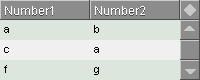
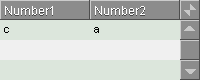
view layout [
  lv: list-view 200x80 with [
    data: [
      ["a" "b"]
      ["c" "a"]
      ["f" "g"]
    ]
  ]
]
Normal view on empty string:
lv/set-filter ""
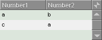
Filtering on string "a":
lv/set-filter "a"
Filtering on string "c":
lv/set-filter "c"
Filtering on string "REBOL":
lv/set-filter "REBOL"
Advanced Filtering
Advanced filters are possible, by creating a filter specification block. This block is managed internally and should not directly be manipulated, so instead the functions SET-FILTER-SPEC and REMOVE-FILTER-SPEC are used.
This way you can create a block of multiple filters that will act on the list.
You can create as many filters as you like and the order is not important, as result rows eliminate each other during the filtering process.
Examples
We start out with a basic list with a variety of data:
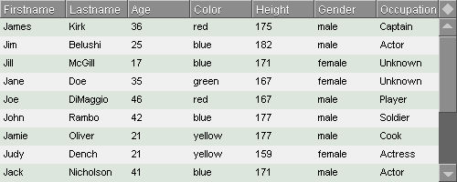
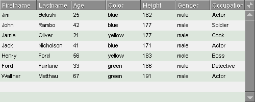
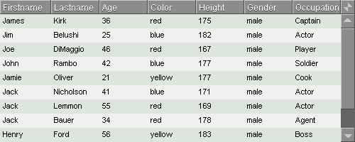
view layout [
  lv: list-view 500x160 with [
    data-columns: [Firstname Lastname Age Color Height Gender Occupation]
    data: [
      ["James"   "Kirk"      36 red    175 male   "Captain"]
      ["Jim"     "Belushi"   25 blue   182 male   "Actor"]
      ["Jill"    "McGill"    17 blue   171 female "Unknown"]
      ["Jane"    "Doe"       35 green  167 female "Unknown"]
      ["Joe"     "DiMaggio"  46 red    167 male   "Player"]
      ["John"    "Rambo"     42 blue   177 male   "Soldier"]
      ["Jamie"   "Oliver"    21 yellow 177 male   "Cook"]
      ["Judy"    "Dench"     21 yellow 159 female "Actress"]
      ["Jack"    "Nicholson" 41 blue   171 male   "Actor"]
      ["Jack"    "Lemmon"    55 red    169 male   "Actor"]
      ["Jack"    "Bauer"     34 red    178 male   "Agent"]
      ["Henry"   "Ford"      56 yellow 183 male   "Boss"]
      ["Audrey"  "Hepburn"   23 blue   168 female "Actress"]
      ["Ford"    "Fairlane"  33 green  186 male   "Detective"]
      ["Walther" "Matthau"   67 green  191 male   "Actor"]
    ]
  ]
]
Each filter consists of an ID word, a value and a column block:
lv/set-filter-spec 'color "red" []
This filter creates a specification called color, which filters through the value, in this case a string called "name". The empty block signifies that all columns should be processed.
To change this particular filter, use SET-FILTER-SPEC again:
lv/set-filter-spec 'color "blue" []
Changing the filter covers all aspects of the filter: the name, the column block and whether the /only refinement is used. (See below)
You can add more filters, just by using SET-FILTER-SPEC again and just use a different name.
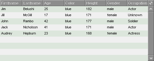
lv/set-filter-spec 'gender "male" []
However since the string is always processed as a substring in a cell (a FORM is done on each row), there will be a problem since "male" is a substring of "female". Therefore in the image above, you'll see that both males and females appear, where they shouldn't.
To solve this, use the /only refinement. When using this refinement, you should also be aware of the datatype of the value you need to filter on. Therefore, since the value in the list is a word for the gender column, you can't use a string:
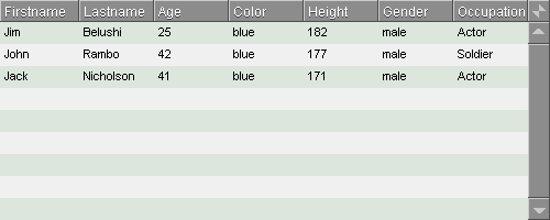
lv/set-filter-spec/only 'gender 'male []
This way the comparison is done on the whole contents of the cell.
The point of stricter type checking is that the datatype is no longer restricted to strings, but can be of any type. As such, you can filter out for objects, integers or other types in your block, but the datatype must match.
To remove a specification:
lv/remove-filter-spec 'color
Inverse Filtering
By using the /not refinement you can inverse the result output from a specific filter:
lv/set-filter-spec/only/not 'color 'red [color]
This leaves out all entries with 'red in the color column.
Column Specific Filtering
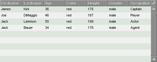
You can use one or more columns to filter on:
lv/set-filter-spec/only 'gender 'male [gender]
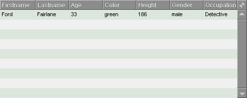
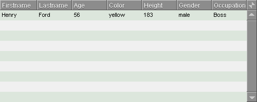
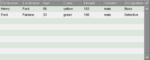
It can be useful in cases like this list where names like Ford Fairlane and Henry Ford appear:
lv/set-filter-spec 'name "ford" [firstname]
lv/set-filter-spec 'name "ford" [lastname]
lv/set-filter-spec 'name "ford" [firstname lastname]
Resetting Filtering
To reset the filter specification:
lv/reset-filter-specs


Optimizations
Similarly as with SET-FILTER, whenever SET-FILTER-SPEC or REMOVE-FILTER-SPEC is used, the list is updated.
If you need to set a larger specification, such as during program initialization, you may not want the list to update visibly. Since it's only possible to build FILTER-SPECS one entry at a time, it's a benefit to turn off updating while this occurs.
lv/update?: false
lv/set-filter-spec/only 'color 'red [color]
lv/set-filter-spec 'name "Jim" [firstname lastname]
lv/set-filter-spec 'occupation "Act" [occupation]
lv/update?: true
After this, updating can be turned back on, since changes will only happen on a single entry in FILTER-SPECS and thereby only cause a single update.
Limitations on Filtering
This doesn't yet work on single blocks as of version 0.0.15.
You cannot use conditions as queries, so you can't say that it should only show for example ages above 37. Only direct equal/non-equal comparisons are possible.
Functions and variables for Filtering
filter-string
String
The filter string which should be used by an external source. As soon as this string is non-empty, filtering occurs.
If SET-FILTER-SPEC is used, this variable is ignored.
filter
Function (internal)
Performs filtering and returns the FILTER-INDEX.
filter-index
Block (internal)
Used internally to select, which rows to show. This index is unsorted.
filtering?
Function
Returns TRUE or FALSE if we are filtering. This is done by checking the contents of FILTER-SPECS and FILTER-STRING.
reset-filter
Function
Resets the FILTER-STRING to "" and updates the list.
filter-spec
Block value which contains the specifications to multi-layer filtering. This is used internally and should not need to be edited by you.
The format of the specification block is:
[
  <name1> [<parameters>] [<string1> <column1> <column2> ...]
  <name2> [<parameters>] [<string2>]
]
An example block, which could comprise of:
- A main filter for all columns for the substring "jones"
- A gender filter the gender column for the full string "male"
- A name filter for two columns name and last-name
- A color which filters out all entries marked with the word 'red in the color column.
[
  main [] ["jones"]
  gender [only] ["male"]
  name [only] ["jim" name last-name]
  color [not] ['red color]
]
filter-row
Function (internal)
Filters a row from FILTER-SPEC.
filter-rows
Function (internal)
Performs multi-layered filtering with FILTER-SPEC.
set-filter
Function
Lets you set a single filter quickly using a single string. The filter works on all columns. Every time the function is used, CNT is set to 0. This means the list is moved to the top.
string The string used in the filter. This function works independently from SET-FILTER-SPEC and doesn't work while a specification is defined in FILTER-SPEC. Thus, it should not be used when SET-FILTER-SPEC is used.
See SET-FILTER-SPEC for advanced multi-layer filtering.
set-filter-spec
Function
Controls FILTER-SPEC and allows you to set and change filter specifications. Every time the function is used, CNT is set to 0. This means the list is moved to the top.
name A word value with the name of the filter value The value that is used in the filter. This value should be a string when not using the /only refinement. columns A block value with the word names of the columns that should be used in this filter. /only When using this refinement, filtering is done on the whole word, rather than a substring. This setting requires that the value input must be of the same datatype as the target you are filtering for. For example when having a column of integer! values, you need to input values of integer! type.
/not When using this refinement, the filtering is negated, so that results that would normally pass through are filtered out and vice versa. For simpler filtering, see SET-FILTER.
remove-filter-spec
Function
Removes one single filter specification and updates the list view.
name The name of the filter to remove (word)
reset-filter-specs
Function
Removes all specifications in FILTER-SPECS and updates the list view.
Sorting Data
LIST-VIEW has actions in the header buttons to let you sort data, just by clicking the buttons. When right clicking a header button, the sorting is reset to 'nosort. Clicking the corner button with the diamond shaped icon, will also reset the sorting to 'nosort.
It's also possible to set initial sort settings for a list.
Sorting Examples
Sorting always works on the fly and does not manipulate or destroy DATA. This means that if you add, edit or remove entries in a list, the list is resorted with the current setting.
To set initial sorting settings:
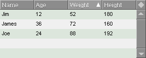
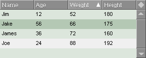
view layout [
  sort-list: list-view 300x150 with [
    data-columns: [Name Age Weight Height]
    data: [
      ["James" 36 72 160]
      ["Jim" 12 52 180]
      ["Joe" 24 88 192]
    ]
  ]
]
You should at this time set the initial sorting after layout. You can though set the SORT-DIRECTION block directly in the layout like this:
sort-direction: [nosort nosort asc nosort]The block must have the same length as the number of viewed columns and the words must also come in the same order.
For an easier method, SET-SORTING can be used after layout:
sort-list/set-sorting 'weight 'asc
If you then want to add a row, you can do that, but you must know that APPEND-ROW, does only append to DATA, but it may be positioned differently in the list due to sorting:
sort-list/append-row/values ["Jake" 56 66 175]
Note that when appending, the new entry is selected. When sorting occurs, the entry stays selected, and you can see it as the second entry in the list.
If the list is larger than the view area, the list will scroll to the selected item, using FOLLOW, if FOLLOW? is set to TRUE, if you change the sort settings.
Sorting Functions and Variables
sort-column
Word
Column that needs to be sorted taken from DATA-COLUMNS.
list-sort
Function (internal)
Creates a sorting index in SORT-INDEX from DATA based on a specific column determined by SORT-COL. Used internally.
sort-index
Block (internal)
Index values of sorted and possibly filtered values in DATA. This is the main index that is used to generated the rows in the list view.
sort-direction
Block (internal)
A block value which contains words for each column. The words can be of the following:
'asc ascending 'desc descending 'nosort to set sorting to the original order that is stored in DATA. This is an internal value and should not be tampered with. To set the sorting direction use SET-SORTING.
tri-state-sort
Word
Sorting mode behavior when clicking a list column header.
true will cycle between ascending, descending and no sorting. false will only switch between ascending and descending
re-sort
Function (Internal)
Re-sorts the list if the length of DATA has changed. This is used internally in the navigation functions.
reset-sort
Function
Resets the SORT-COL to NONE and SORT-DIRECTION to NOSORT and updates the list.
set-sorting
Function
Sets sorting column and direction and updates the list.
column Column to sort as given in DATA-COLUMNS (word) direction Sort direction (word) The direction can be:
'asc ascending 'desc descending 'nosort to set sorting to the original order that is stored in DATA.
allow-sorting
Flag
When set to FALSE, the header buttons are locked and the corner glyph is blanked out. When clicking on the header buttons, nothing will happen. Sorting direction is invisible.
view layout [
  list-view 160x100 with [
    allow-sorting: false
  ]
]
Default is TRUE.
Note that this does not affect the use of sorting functions, so if you want to set up a specific sorting mode and disallow sorting by the user, you can do that with ALLOW-SORTING.
Sorting Limitations
Currently, sorting is not data type aware and such all values are converted to strings. Therefore numbers are not sorted correctly.
Navigating the List
When navigating the list, LIST-VIEW automatically goes back and forth, selecting rows, no matter whether they are filtered or sorted.
cnt
Integer
Count value, zero-based. Used by LIST-VIEW to determine which row to draw first at the top of the list.
sel-cnt
Integer (internal)
The select counter, one-based. Determines which single row should be highlighted.
old-sel-cnt
Integer (internal)
Previously selected row. Used internally to track changed in the selected rows, and you shouldn't modify it.
selected?
Function
Returns TRUE if there is a row selected in the list view, FALSE if not.
col-idx
Gets the index of the word at a column from DATA-COLUMNS.
/viewed Uses VIEWED-COLUMNS instead of DATA-COLUMNS.
selected-column
Word
Name of selected column in VIEWED-COLUMNS. This is changed whenever a row is single clicked.
flt-sel-cnt
Integer (internal)
Takes SEL-CNT and picks a value from FLT-INDEX to get the filtered row. Used internally.
first-cnt
Function
Go to the first row in the list. This works whether filtering and/or sorting is enabled or not.
/act Perform LIST-ACTION on the selected row When UPDATE? is set to FALSE, this function doesn't produce a visible result.
prev-page-cnt
Function
Go one page up in the list. This works whether filtering and/or sorting is enabled or not.
/act Perform LIST-ACTION on the selected row When UPDATE? is set to FALSE, this function doesn't produce a visible result.
prev-cnt
Function
Go to the previous in the list. This works whether filtering and/or sorting is enabled or not.
/act Perform LIST-ACTION on the selected row When UPDATE? is set to FALSE, this function doesn't produce a visible result.
next-cnt
Function
Go to the next row in the list. This works whether filtering and/or sorting is enabled or not.
/act Perform LIST-ACTION on the selected row When UPDATE? is set to FALSE, this function doesn't produce a visible result.
next-page-cnt
Function
Go one page down in the list. This works whether filtering and/or sorting is enabled or not.
/act Perform LIST-ACTION on the selected row When UPDATE? is set to FALSE, this function doesn't produce a visible result.
last-cnt
Function
Go to the last row in the list. This works whether filtering and/or sorting is enabled or not.
/act Perform LIST-ACTION on the selected row When UPDATE? is set to FALSE, this function doesn't produce a visible result.
max-cnt
Function
Go to the last appended row in DATA. This does not take filtering and/or sorting into account.
/act Perform LIST-ACTION on the selected row When UPDATE? is set to FALSE, this function doesn't produce a visible result.
min-cnt
Function
Go to the first inserted row in DATA. This does not take filtering and/or sorting into account.
/act Perform LIST-ACTION on the selected row When UPDATE? is set to FALSE, this function doesn't produce a visible result.
limit-sel-cnt
Function
Moves the selection within the start or the end of the shown list. This works whether filtering and/or sorting is enabled or not.
/act Perform LIST-ACTION on the selected row When UPDATE? is set to FALSE, this function doesn't produce a visible result.
reset-sel-cnt
Function
Resets SEL-CNT and OVR-CNT to NONE. When updating the list view with UPDATE, no rows will be selected.
scroll-here
Function
Scrolls the list so the selected value comes into view.
When UPDATE? is set to FALSE, this function doesn't produce a visible result.
follow
Function
Function that activates SCROLL-HERE if FOLLOW? is TRUE.
This only works when SELECT-MODE is either 'single or 'row.
When UPDATE? is set to FALSE, this function doesn't produce a visible result.
follow?
Flag
Allows llows SCROLL-HERE to work in the navigation functions if set to TRUE. Will also make sure the selected row is constantly in view when sorting.
value-size
Function
Returns the length of the visible number of rows in the list view.
lock-list
Flag
Locks the list from letting a user select values, so you can only scroll, but not click, alt-click or double-click.
head-cnt?
Function
Checks whether the selected row is the first one in the sorted list.
tail-cnt?
Function
Checks whether the selected row is the last one in the sorted list.
range
Block
Removed from LIST-VIEW 0.0.39.
Images
This may be deprecated very soon. See ROW-ACTION for similar functionality.
LIST-VIEW supports two ways of doing images:
- A simple way as described in this chapter. You can specify that a specific column in DATA should be of the image! type, by simply copying an image into the column, which will tell LIST-VIEW that this column should be rendered as an image instead of text.
- A much more flexible but a little harder way, using ROW-ACTION.
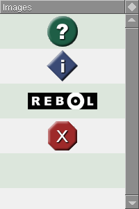
To use images, you need to LOAD an image! into the row or have a few ready. The images below are internal to REBOL/View:
view layout [
  list-view 200x300 with [
    data-columns: [Images]
    data: reduce [help.gif info.gif logo.gif stop.gif]
    row-height: 50
  ]
]
The images are rendered inside the face in their original size and centered using EFFECT.
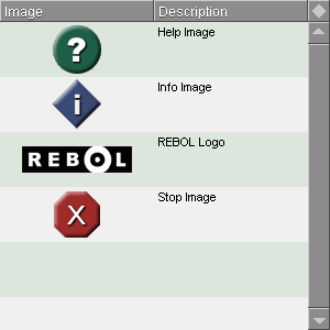
You can freely mix images and text:
view layout [
  list-view 300x300 with [
    data-columns: [Image Description]
    data: compose/deep [
      [(help.gif) "Help Image"]
      [(info.gif) "Info Image"]
      [(logo.gif) "REBOL Logo"]
      [(stop.gif) "Stop Image"]
    ]
    row-height: 50
  ]
]
It's also possible to mix images and text in the same column, since LIST-VIEW autodetects image! in a cell in DATA.
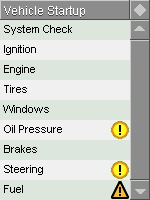
warning: load %warning.png
fatal: load %fatal.png

view layout [
  list-view 150x200 with [
    data-columns: [Action Image]
    row-height: 24
    fonts: [[valign: 'center]]
    header-columns: ["Vehicle Startup"]
    widths: [100 24]
    resize-column: 'action
    data: compose/deep [
      ["System Check" (none)]
      ["Ignition" (none)]
      ["Engine" (none)]
      ["Tires" (none)]
      ["Windows" (none)]
      ["Oil Pressure" (warning)]
      ["Brakes" (none)]
      ["Steering" (warning)]
      ["Fuel" (fatal)]
    ]
  ]
]
Limitations on Images
You can only use centered images in their original size. No translation, effects or scaling is possible. For full control over images see ROW-ACTION.
Configuration
This is not yet implemented
To quickly store a configuration of the list view, the function EXPORT can be used. It creates an object with all data used to configure the list view, such as size, headers, sorting order and column, list scroller position, colors, all except for DATA and functions.
The function IMPORT can take an exported configuration object and insert its values into the given list view. After this is done, the list view is automatically updated.
import
Function
Not yet implemented
Imports a list of settings into the list view face object and updates it immediately.
data A data object containing configuration settings for the list view. This object can be generated with EXPORT (object)
export
Function
Not yet implemented
Returns an object to be used by IMPORT. It can be saved for later retrieval.
Example
layout [lv: list-view]
save/binary %li.config mold/all lv/export
Customizing Appearance
The list can be customized in many different ways.
colors
Block
The colors are a block of tuples referred to by word. For the standard settings, the colors are:
even              240.240.240
odd               220.230.220
select-focus      180.200.180
select-unfocus    180.180.180
background        140.140.140
header-fill       120.120.120
header-background 140.140.140
header-inactive   140.140.140
header-active     155.155.155
glyph             200.200.200
list-edge         140.140.140
edit-field        240.240.240
drag-edge         100.100.100
To access a color in list LV:
lv/colors/evenTo modify a color:
lv/colors/even: 128.240.50
spacing
Pair
Adds spacing between rows and columns in pixels. The total height of the row will then be ROW-HEIGHT + SPACING/Y. The total width of column will remain the same, as the spacing will "eat in" on the right side of each column, except the last one to keep things pretty.
Examples
Spacing between rows
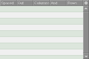
view layout [
  list-view with [
    data-columns: [Spaced Out Columns And Rows]
    spacing: 0x1
  ]
]
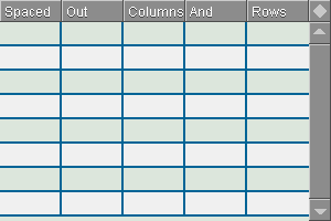
view layout [
  list-view with [
    data-columns: [Spaced Out Columns And Rows]
    spacing: 1x0
  ]
]
Spacing between columns
Spreadsheet style
view layout [
  list-view with [
    data-columns: [Spaced Out Columns And Rows]
    spacing: 1x1
  ]
]


spacing-color
Tuple
Will set the color of the spacing between cells, both vertically and horizontally.
Example
view layout [
  list-view with [
    data-columns: [Spaced Out Columns And Rows]
    spacing: 2x2
    spacing-color: 0.100.150
  ]
]
standard-font
Object
Font object that is globally used in the list entries. Header is unaffected. (object)
This can be used to change the font in list entries, if you re-make STANDARD-FONT with new parameters.
Example
Changing the standard font:
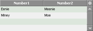
view layout [
  list-view with [
    data: [["Eenie" "Meenie"]["Miney" "Moe"]]
    standard-font: make standard-font [name: "tahoma"]
  ]
]
standard-para
Object
Para object that is globally used in the list entries. Header is unaffected.
This can be used to change the paragraph layout in list entries, if you re-make STANDARD-PARA with new parameters.
Example
Changing the paragraph layout:
view layout [
  list-view with [
    data: [["Eenie" "Meenie"]["Miney" "Moe"]]
    standard-font: make standard-font [name: "tahoma"]
  ]
]
standard-header-font
Object
This is the standard font object for the header sort buttons.
Example
Changing the header font:
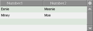
view layout [
  list-view with [
    data: [["Eenie" "Meenie"]["Miney" "Moe"]]
    standard-header-font: make standard-header-font [
      name: "tahoma"
      size: 11
      style: 'bold
      shadow: none
      align: 'center
    ]
  ]
]
standard-header-para
Object
This is the standard para object for the header sort buttons.
Example
Changing the header paragraph layout:
view layout [
  list-view with [
    data: [["Eenie" "Meenie"]["Miney" "Moe"]]
    standard-header-para: make standard-header-para [origin: 20x2]
  ]
re ]
edged-size
Pair
The size of the list view without enclosing edge. Used internally.
button-edge
Object
This is an edge object, which defines all edges in the buttons in the header of the list view. Changing this will let you change how the edge looks.
drag-edge
Object
This is an edge object which defines the edge around a dragged column. Dragged columns are not yet implemented.
fonts
Block
Deprecated. Use ROW-ACTION to achieve the same functionality.
A block of either font objects or blocks to specify the font for each column.
Examples
Using blocks:
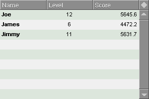
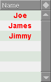
view layout [
  list-view with [
    data-columns: [Name Level Score]
    data: [
      ["Joe" 12 5645.6]
      ["James" 6 4472.2]
      ["Jimmy" 11 5631.7]
    ]
    fonts: [
      [style: 'bold]
      [align: 'center]
      [align: 'right]
    ]
  ]
]
Using objects:
view layout [
  list-view with [
    data-columns: [Name]
    data: [
      ["Joe"]
      ["James"]
      ["Jimmy"]
    ]
    fonts: [
      make object! [size: 14 style: 'bold color: red align: 'center]
    ]
  ]
]
If you use multiple columns, you can settle for setting the font for the first column, if they should all be the same.
paras
Block
Deprecated. Use ROW-ACTION to achieve the same functionality.
A block of either para objects or blocks to specify the paragraph settings for each column. This among other things enables the use of multi-line cells.
Example
Multi-line cells
view layout [
  list-view with [
    data-columns: [Name Text Time]
  ]
  data: [
    []
  ]
  paras: []
]
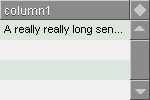
truncate
Flag
When set to TRUE, the text in a field is truncated with an ellipsis "...". It will also be set for fields with more than one line of text, so only the first line is displayed. When set to FALSE, the text will not be truncated. This truncation does not affect the contents of the field and is purely for cosmetic purposes.
There could be a small performance penalty with this on slower machines, so TRUNCATE is turned off by default.
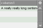
Example
view layout [
  lv: list-view 150x100 with [
    data: ["A really really long sentence"]
    truncate: false
  ]
]
lv/truncate: true
lv/update
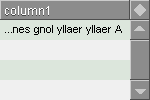
Using TRUNCATE with ROW-ACTION
TRUNCATE happens before ROW-ACTION. The row action can cancel out truncation so it will not appear or become distorted.
Example
view layout [
  lv: list-view 150x100 with [
    data: ["A really really long sentence"]
    truncate: true
    row-action: [
      cell/text: reverse cell/text
    ]
  ]
]
Limitations
Truncation only works in the textfields, not the headers.
row-face
Block
Block of a layout face used to create a custom row in the list. This face can also be found as a processed layout in LST/SUBFACE.
scroller-width
Integer
Sets the scroller width in pixels for both the horizontal and the vertical scroller.
Examples
Smaller scroller
view layout [
  list-view with [
    scroller-width: 15
  ]
]
Bigger scroller
view layout [
  list-view with [
    scroller-width: 30
  ]
]
fill
Flag
When set to TRUE, will show rows all the way down the list. If set to FALSE, only rows within the data range (even empty rows) will be shown.
lst-lo
Function
Function to create the row layout from VIEWED-COLUMNS and the widths gotten from WIDTHS. Used internally.
lst
Object
The list face.
hdr
Object
The header face.
scr
Object
The scroller face.
hscr
Object
The horizontal scroller face.
edt
Object
The edit fields face.
Setting a Custom Row Layout
Like LIST, LIST-VIEW uses an iterated layout to produce the rows of the list. This means, for each row, there is a layout created and reproduced for the list. This layout can be customized by changing LST/SUBFACE.
Normally the subface is automatically generated from VIEWED-COLUMNS and WIDTHS, but you can create your own layout. LIST-VIEW uses a face called LIST-TEXT, to generate the cells in the list. It contains a FEEL object that makes it possible to do selection. It's therefore important to use LIST-TEXT, or its FEEL object if you want the list to function correctly.
The cost of this, as of version 0.0.14 (this will probably change later) is that the list is not resizable horizontally anymore.
To change the layout, use:
lv/row-face: [
  across space 0
  list-text 100 bold
  list-text 150 right
]
If you want a more elaborate change, you can use multiple subrows per row:
lv/row-face: [
  across space 0
  list-text 200x20
  list-text 50x20 gray font-size 14 bold right return
  list-text 250x20 gray right font-size 10
]
To change the layout on the fly, use:
lv/update/force
Header
If you provide only a single word in a block as the header name, it will stretch to fit the width of the list. This is useful if you want to create a custom layout, that is not arranged in columns.
Furthermore you can set SORT-COL to a specific DATA-COLUMNS word to let you sort by the column you desire on that single header button.
A more complete example:
view layout [ list-view 300x300 with [ data: [ [Chewbacca 40 Tatooine] ["Luke Skywalker" 19 Tatooine] ["Qui-Gon Jinn" 48 Coruscant] ["Obi-Wan Kenobi" 35 Coruscant] [Palpatine 60 Coruscant] ["Padm� Amidala" 20 Naboo] ["Darth Vader" 50 "Death Star"] ] data-columns: [Name Age Location] header-columns: ["Star Wars Characters"] row-face: [ across space 0 list-text 200x20 list-text 50x20 reblue font-size 14 bold right return list-text 250x15 gray right font-size 10 ] ] ]
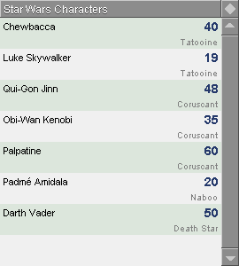
Inline Editing
Inline Editing has been implemented from version 0.0.17. It simply works by doubleclicking on a line, and a set of LIST-FIELDs appear in the place of the text fields with their values in there. DOUBLECLICK-LIST-ACTION is not affected by having inline editing.
It's implemented so that you don't need to perform any tasks to manipulate DATA, but does this automatically. In essence, the listview becomes a data editor in itself. Also if you reorder columns, add/remove columns, the fields will automatically adjust accordingly.
By default inline editing is disabled. To enable it, set EDITABLE? to TRUE.
The edit face is stored in EDT.
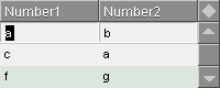
Inner Workings
The process of initializing inline editing is done through SHOW-EDIT. What happens is that when SHOW-EDIT is invoked, the edit fields are initialized with copies of the values that are stored in that row in DATA. They are not bound, due to reasons we'll see later.
When SHOW-EDIT is invoked, it investigates whether words are stored in READONLY-COLUMNS and EDITABLE-COLUMNS. This is used to determine which columns should have a face and which ones are left "blank". In reality, non-editable fields have a copy of the original face layered on top of the original face.
ROW-FACE vs. standard.
Note that when using ROW-FACE, the arrangement of the faces may not be directly left-to-right, but can be arranged below each other. Even in this case, the manual will refer to each cell as a column.
SHOW-EDIT simply registers the size of each cell and adapts the edit fields to that.
Focusing
After EDT is generated, it needs to focus in the right cell. By standard, it will focus in the cell that is determined by SELECTED-COLUMN. SELECTED-COLUMN is before that determined by the position of the mouse pointer.
If the cell is blocked by READONLY-COLUMNS or EDITABLE-COLUMNS, it will proceed towards the right and wrap to the left and continue to the right until a field is found.
Editing
Submitting
Limitations of Inline Editing
Currently it's only possible to edit rows, not single cells, unless you use the READONLY-COLUMNS block or the EDITABLE-COLUMNS block and block out all columns except one.
Functions and Variables for Inline Editing
editable?
Flag
true Inline editing is activated by doubleclicking on the row you wish to edit. false Inline editing by double clicking is ignored. This doesn't affect the SHOW-EDIT function, but prevents the user from activating it by double click. This flag does not affect DOUBLECLICK-LIST-ACTION.
immediate-edit?
Flag
true This will cause the inline editing to be activated, immediately when clicking on a row. false This will cause the inline editing only to be activated when a row is double-clicked. This flag only works when EDITABLE? is set to TRUE.
show-edit
Function
Shows the edit fields at the selected position. This only works when SELECT-MODE is 'row. Also creates a reference from the edit fields to the specific location in DATA.
/column Specify which edit field to start focusing on (word) Focusing
By default when invoked through program code, the focus is the left most field.
If invoked through double clicking when EDITABLE? is TRUE, the field which is either under or to the right of the mouse pointer is focused. This loops around the columns and starts at the left most column until a field is found.
When SHOW-EDIT has been invoked, using a function to manipulate the size of the list, such as APPEND-ROW, followed by another SHOW-EDIT, will link two strings in DATA to the same string in the edit field, thus corrupting the contents of DATA.
Therefore before doing any manipulations on DATA, it's a good idea to invoke HIDE-EDIT.
I will try to fix this in an upcoming release.
submit-edit
Function
Stores the edit in LAST-EDIT and returns the edited row.
/cancel Will cancel the editing process and restore the row with data from OLD-EDIT.
hide-edit
Function
Hides the edit fields. Returns NONE if the function is run without EDT being shown, and returns the edited result row if EDT was shown. The edited row is stored whether or not any changes are made to it.
To show that the fields are actually hidden, a REFRESH or UPDATE should be issued.
/no-submit This refinement reverts the contents of the edit fields with their original contents before they are hidden. The contents are still saved. This is done internally using SUBMIT-EDIT/CANCEL.
last-edit
Block
The last edited row is stored here. This is useful if you want to use the result of HIDE-EDIT in LIST-ACTION. Note that if HIDE-EDIT is run without EDT being shown, for example by running SHOW-EDIT first, this variable will contain NONE.
readonly-columns
Block
Block which holds words for columns that are supposed to be read only. When specific words are set, those columns will not have an inline edit field and the columns will not be overwritten.
This read only functionality only works with inline editing, not with normal DATA manipulation functions.
Example
Make the center column read only.
view layout [
  lv: list-view with [
    data-columns: [a b c]
    readonly-columns: [b]
  ]
]
lv/append-row/values [
  "Edit this column"
  "You can't edit this one!"
  "Edit this column"
]
lv/show-edit
The read-only columns are in the inline edit area replaced by a grey box with the field text in it.
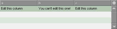
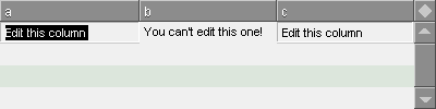
editable-columns
Function
This is the DIFFERENCE result of READONLY-COLUMNS and VIEWED-COLUMNS and is calculated internally, if it's not set directly in your layout.
This is more useful if you have many columns and wish only to edit a few.
Example
>> lv/viewed-columns: [age height weight]
>> lv/readonly-columns: [age]
>> lv/update

>> lv/editable-columns
== [height weight]
Actions
Various actions can be carried out when performing certain user operations on LIST-VIEW. They are stored as a block which then is DO'ed with the DO-ACTION function internally, except for ROW-ACTION.
Certain actions have certain requirements to be run:
Action Name
Performed By
Selected Row Required LIST-ACTION
DO-ACTION
Yes
OVER-ROW-ACTION
DO-ACTION
No
ALT-LIST-ACTION
DO-ACTION
Yes
DOUBLECLICK-LIST-ACTION
DO-ACTION
Yes
EMPTY-ACTION
DO-ACTION
No
ALT-EMPTY-ACTION
DO-ACTION
No
DOUBLECLICK-EMPTY-ACTION
DO-ACTION
No
EDIT-ACTION
DO-ACTION
Yes
TAB-EDIT-ACTION
DO-ACTION
Yes
PRE-SUBMIT-EDIT-ACTION
DO-ACTION
Yes
SUBMIT-EDIT-ACTION
DO-ACTION
Yes
ROW-ACTION
PANE-FILL
No
REFRESH-ACTION
DO-ACTION
No
SORT-ACTION
DO-ACTION
No
DROP-ACTION
DO-ACTION
No
From within all action contexts, you can have access to the entire LIST-VIEW object. Some actions have additional words bound to them, that are useful in the given situation.
Example
Click a row and get the word name of the column that was clicked. When clicking a row, LIST-ACTION can be invoked, if it's defined.
view layout [
  lv: list-view [
    data-columns: [a b c]
    data: [
      [1 2 3]
      [4 5 6]
      [7 8 9]
    ]
  ]
]
The action can contain functions without referring to the variable used in the layout to reference the list itself. To get the selected column, we use the SELECTED-COLUMN variable.
lv/list-action: [probe selected-column]It's easy to add more functionality. We can get the contents of the single cell that was clicked:
lv/list-action: [probe get-cell selected-column]and so forth.
list-action
Block
DO this block when clicking on a row with data in it. LIST-ACTION is performed on mouse-down, when using a select mode that only allows single cells, rows or columns to be selected. When using a select mode that allows for multiple selections, it's performed on mouse up. This is in order to allow multi-selecting, using the Shift key.
alt-list-action
Block
DO this block when right-clicking on a row with data in it. ALT-LIST-ACTION is performed on mouse-down, when using a select mode that only allows single cells, rows or columns to be selected. When using a select mode that allows for multiple selections, it's performed on mouse up. This is in order to allow multi-selecting, using the Shift key.
doubleclick-list-action
Block
DO this block when double-clicking on a row with data in it. This has no effect on activating inline editing, if EDITABLE? is TRUE.
empty-action
Block
DO this block when clicking on an empty row. This action is always performed on mouse down.
alt-empty-action
Block
DO this block when alt-clicking on an empty row. This action is always performed on mouse down.
doubleclick-empty-action
Block
DO this block when double-clicking on an empty row. This has no effect on activating inline editing, if EDITABLE? is TRUE.
edit-action
Block
DO this block when SHOW-EDIT is run, e.g. when doubleclicking on a row to show the edit fields, if EDITABLE? is TRUE.
Note that when EDIT-ACTION is defined, fields are NOT automatically filled with the values from the row to let you do that yourself.
You can use EDIT-ACTION, if you want to perform a conversion of the row data, before the inline edit fields appear. This action is then performed during SHOW-EDIT.
In order to do this, you have full access to LIST-VIEW's variables to evaluate the situation. Certain values are useful in this context:
data-columns The words stored in here are the same as for VAR in each of the inline edit fields.This is currently not functioning. I need to solve some binding problems here.focus-column The word value of the column currently in focus. edit-index The index of the column currently in focus. edit-value The value of the field currently in focus. edit-field The face field that currently in focus. This is a normal face with variables like TEXT, DATA, PARENT-FACE, etc. Beyond these, the edit fields are available as the words given in DATA-COLUMNS, so if the first column is named WEIGHT in VIEWED-COLUMNS, you'd get the value of the field by:
get-face weightJust like a normal text field in VID.
You can also intercept the displaying of the inline editing fields, by returning FALSE or NONE rather than a value at the end. If FALSE or NONE is returned, the inline editing fields are not displayed and the editing process is skipped.
Examples
You want the user not to be able to edit the row with ID = 3, only other rows:
view layout [
  lv: list-view 300x100 with [
    editable?: true
    data-columns: [ID Superhero]
    data: [[1 "Batman"] [2 "Superman"] [3 "Bicyclerepairman"]]
    edit-action: [
      either 3 = get-cell 'ID [false][true]
    ]
  ]
]
You want to convert the text values with units to decimal values in the fields, to avoid cluttering up the field with unnecessary characters.
There are three columns, age, weight and height. In the list a row is written as three strings: "58 years", "73 kg" and "171 cm". By cutting the string at the space in two halves, the first half can be converted to a number.
view layout [
  lv: list-view 300x100 with [
    editable?: true
    data-columns: [age weight height]
    edit-action: [
      set-face age first parse get-cell 'age none
      set-face weight first parse get-cell 'weight none
      set-face height first parse get-cell 'height none
      true
    ]
  ]
]
lv/append-row/values ["58 years" "73 kg" "171 cm"]
The row looks like this:
When editing with double-clicking or just invoking SHOW-EDIT, the contents will change according to EDIT-ACTION:
lv/show-edit

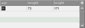
tab-edit-action
Block
DO this block when tabbing out of an inline edit field. This is run for all fields, including the last one, and for the last one, before PRE-SUBMIT-EDIT-ACTION is run.
You can use TAB-EDIT-FUNCTION to perform validation and/or conversion of field data, before it's submitted to the list view, such as converting an integer! value to a money! value or refocus a field, if the contents are incorrect.
In order to do this, you can extract all variables from LIST-VIEW to evaluate the situation. Certain variables are useful in this context:
focus-column The word value of the column, you are tabbing out of. edit-index The index of the column, you are tabbing out of. edit-value The value of the field, you are tabbing out of. edit-field The field face you are tabbing out of. This is a normal face with variables like TEXT, DATA, PARENT-FACE, etc. Beyond these, the edit fields are available as the words given in DATA-COLUMNS, so if the first column is named WEIGHT and the second one is HEIGHT in VIEWED-COLUMNS, you can access the contents directly, to, say, calculate a Body Mass Index:
tab-edit-action: [
  print multiply weight power height 2
]
This makes it possible to create calculations based on information available in an entire row.
Examples
This example continues from the one shown in EDIT-ACTION right above.
With each column, you only want integers to be entered. If the value can't be converted to an integer, the field must be refocused with the value selected, so you can easily change it.
From the last example we had the inline editing activated:
So when you tab through it, you need to check whether the field can be converted to an integer, in case a letter or other character was entered by accident. If not, the field must be refocused:
lv/tab-edit-action: [
  all [
    attempt [to-integer edit-value]
    focus get focus-column
  ]
]

pre-submit-edit-action
Block
DO this block when tabbing out of the last inline edit field or if there is only one column and therefore one edit field. PRE-SUBMIT-EDIT-ACTION is run after TAB-EDIT-ACTION, but before the edit fields are hidden.
It's also run right before edit fields are hidden, if you click outside the edit fields to hide the edit fields, for example, when clicking a header or another row in the list.
To invoke PRE-SUBMIT-EDIT-ACTION manually, you must use PRE-SUBMIT-EDIT-FUNC.
Example
This example continues from the two other examples in EDIT-ACTION and TAB-EDIT-ACTION above.
When finishing the editing, the row must be stored, but we want to store it with the units shown in the first example in EDIT-ACTION. This means, we need to pad the right units to the number of each field.
lv/pre-submit-edit-action: [
  age/text:    join age/text " years"
  weight/text: join weight/text " kg"
  height/text: join height/text " cm"
]
EDITABLE-COLUMNS is traversed and for each column, the fields are set to the integer value, padded with the unit. When that is done, the altered fields are stored in the selected row. Here we invoke PRE-SUBMIT-EDIT-FUNC manually:
lv/pre-submit-edit-func
lv/hide-edit
lv/update
This action is renamed from FINISH-EDIT-ACTION from version 0.0.50. It does the same, so you should rename FINISH-EDIT-ACTION to PRE-SUBMIT-EDIT-ACTION in your code.
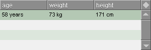
submit-edit-action
DO this block right after SUBMIT-EDIT has been completed. The terms of usage are the same as for PRE-SUBMIT-EDIT-ACTION.
cancel-edit-action
Block
DO this block when you cancel a SHOW-EDIT to undo the edits that you were performing.
It allows you to perform additional actions, to restore the list-view to a previous state, if some actions were performed around SHOW-EDIT, for example when you append a row to the list before using SHOW-EDIT.
This action will allow you to remove the row again or do other appropriate things.
Note that the function is NOT necessary to use, if you want to cancel editing of contents generally. LIST-VIEW performs the restoration of the original content in the edited row automatically.
refresh-action
Block
DO this block when REFRESH is called. This is useful if you have a display of the number of items in the list or similar mechanism that needs to change according to the length of DATA in the list.
over-row-action
Block
DO this block when mouse is hovering over a row.
drop-action
Block
DO this block when releasing the mouse button over a row after a drag'n'drop operation.
This works only when drag'n'drop is activated with REDRAGGABLE-ROWS.
sort-action
Block
DO this block when clicking on any header button. This only works when ALLOW-SORTING is set to TRUE.
row-action
Block
DO this block when a cell is being displayed. This action is a bit special since it can't directly be invoked by the user, but offers control over the contents and the faces of the row that is going to be displayed.
This control can be based on any kind of input, for example values from DATA, row numbers or which column is going to be drawn up next.
You can evaluate on all columns, not just visible ones. This makes it possible to set row states visually for columns that aren't displayed, such as a user list in a chat program, which could alter the color of a person, if he/she said something.
ROW-ACTION is the last part processed before the list is displayed, so it overrides what happens in other variables that manipulate the cell face, such as FONTS, WIDTHS, the selected row color and even text values in DATA.
Row Action Elements
ROW-ACTION binds to various elements to allow you easy access to manipulating the current row:
CELL This is the current cell face being processed. Use this if you don't care about which column you are about to alter. To set all cells to bold face, just access it like a normal face:
cell/font/style: 'bold
CELLS This is a block of alternating words and faces. The words are those represented in VIEWED-COLUMNS, while the faces are those of the currently processed row. To set a specific column to bold face, use CELLS as the base and the column name as refinement:
cells/age/font/style: 'bold
COLUMN This is the current word value of the cell face being processed. Use this to limit processing of specific parts of your ROW-ACTION to a specific cell. Using this in conjunction with SWITCH is a good structure to base more complex ROW-ACTIONs on. ROW This is the current row as an integer of the row being processed. Use this to compare with SEL-CNT, in order to alter processing over the selected row. To access data for the current row in DATA, use the words from DATA-COLUMNS:
if age = 25 [cells/age/font/style: 'bold]Beyond this the function block has access to all parts of LIST-VIEW.
Row actions are only evaluated on rows with contents, so if you have 10 visible rows, but only 3 rows in DATA, only the first 3 will be evaluated.
Row Actions and Iterated Faces
Since LST generates entries through an iterated face, you must take this into account when creating a row action that manipulates the appearance of the cell face: When the change has been done, it's not reset when the list is drawing up subsequent rows, but continues in the style you've set. Furthermore, the style will continue when the list is redrawn from the top.
Therefore it's best to keep the original color black handy:
cell/font/color: either name = "Skywalker" [blue][black]Examples
A single condition checks a value in a column and changes the font color for the entire row if the condition is true. If it's false, nothing will happen.
view layout [
  list-view 100x160 with [
    data-columns: [Core Temperature]
    data: [
      ["Reactor Core 1" 1400]
      ["Reactor Core 2" 3400]
      ["Reactor Core 3" 7600]
      ["Reactor Core 4" 4500]
    ]
    row-action: [
      cell/font/color: either temperature > 5000 [red][black]
    ]
  ]
]
You can use any other kind of information to make row actions. This one grays out the text of the list if the list is locked with LOCK-LIST.
view layout [
  list-view 100x160 with [
    lock-list: true
    data-columns: [name age]
    data: [
      ["Jack" 37]
      ["James" 26]
      ["Jim" 65]
      ["Joan" 45]
    ]
    row-action: [
      cell/font/color: either lock-list [gray][black]
    ]
  ]
]
Multiple conditions can be used in a ROW-ACTION:
view layout [
  list-view 100x160 with [
    data-columns: [name status role]
    viewed-columns: [name]
    data: [
      ["James" here user]
      ["Jake" away admin]
      ["John" offline user]
      ["Jim" here user]
      ["Joe" away guest]
    ]
    row-action: [
      cell/font/style: none
      cell/font/color: black
      if role = 'admin [cell/font/style: 'bold]
      if status = 'away [cell/font/color: gray]
    ]
  ]
]
To change specific cells, use CELLS with a refinement with the name of the column:
view layout [
  list-view 120x160 with [
    data-columns: [name status role]
    viewed-columns: [name status]
    data: [
      ["James" here user]
      ["Jake" away admin]
      ["John" offline user]
      ["Jim" here user]
      ["Joe" away guest]
    ]
    row-action: [
      cells/status/color: switch/default status [
        here    [0.200.0]
        away    [red]
        offline [gray]
      ][black]
    ]
  ]
]
A more elaborate example takes advantage of DRAW to draw something in a cell based on input from DATA. To avoid obstruction from the text that is normally inserted, the text for the cell is set to NONE:
view layout [
  list-view 120x160 with [
    data-columns: [Name Status Role]
    viewed-columns: [name status]
    header-columns: ["Buddies"]
    widths: [80 20]
    data: [
      ["James" here user]
      ["Jake" away admin]
      ["John" offline user]
      ["Jim" here user]
      ["Joe" here guest]
    ]
    row-action: [
      cells/name/font/style: none
      if role = 'admin [cells/name/font/style: 'bold]
      cells/status/text: none
      cells/status/effect: switch/default status [
        here    [[draw [pen black fill-pen 0.200.0 translate 5x5 circle 5x5]]]
        away    [[draw [pen black fill-pen red translate 5x5 circle 5x5]]]
        offline [[draw [pen black fill-pen gray translate 5x5 circle 5x5]]]
      ][none]
    ]
  ]
]
Since ROW-ACTION is performed per cell, it might be appropriate to split actions up and only let them be run on the right column. This will avoid setting colors, effects multiple times for the same cell, which decreases performance.
This can be done by reading the COLUMN variable:
view layout [
  list-view 120x160 with [
    data-columns: [Name Status Role]
    viewed-columns: [name status]
    header-columns: ["Buddies"]
    widths: [80 20]
    data: [
      ["James" here user]
      ["Jake" away admin]
      ["John" offline user]
      ["Jim" here user]
      ["Joe" here guest]
    ]
    row-action: [
      switch column [
        name [
          cells/name/font/style: none
          if role = 'admin [cells/name/font/style: 'bold]
        ]
        status [
          cells/status/effect: switch/default status [
            here    [[draw [pen black fill-pen 0.200.0 translate 5x5 circle 5x5]]]
            away    [[draw [pen black fill-pen red translate 5x5 circle 5x5]]]
            offline [[draw [pen black fill-pen gray translate 5x5 circle 5x5]]]
          ][none]
        ]
      ]
    ]
  ]
]
ROW-ACTION can take advantage of knowing where the select cursor is and manipulate the appearance of the select cursor. The select cursor is just a change in background color for a specific row, so we can manipulate it the same way as the other rows.
We can do this by adding this to the existing row action. Since the row action already uses an effect on each row, we should append the effect
view layout [
  lv: list-view 120x160 with [
    data-columns: [Name Status Role]
    viewed-columns: [name status]
    header-columns: ["Buddies"]
    widths: [80 20]
    data: [
      ["James" here user]
      ["Jake" away admin]
      ["John" offline user]
      ["Jim" here user]
      ["Joe" here guest]
    ]
    row-action: [
      ; ---------- Selected Row
      cell/effect: copy either sel-cnt = row [
        [gradient 0x1 0.120.240 0.80.120]
      ][[]]

      ; ---------- Cells
      switch column [
        name [
          cells/name/font/style: none
          if role = 'admin [cells/name/font/style: 'bold]
        ]
        status [
          append cells/status/effect switch/default status [
            here    [[draw [pen black fill-pen 0.200.0 translate 5x5 circle 5x5]]]
            away    [[draw [pen black fill-pen red translate 5x5 circle 5x5]]]
            offline [[draw [pen black fill-pen gray translate 5x5 circle 5x5]]]
          ][none]
        ]
      ]

    ]
  ]
]

lv/find-row/column 'away 'status
It does not take advantage of RANGE yet, only SEL-CNT.
ROW-ACTION has a new feature in version 0.0.50 to fetch data about the previous row and the next row as the list view is being rendered. This is built in using the new GROUP-ROWS-BY feature.
When GROUP-ROWS-BY is set to a specific column, this allows you to make several rows appear as if they are grouped by color or a piece of graphic and you can trigger the display of a change to a new group, using the new GROUP-ROW-TYPE that ROW-ACTION has access to.
GROUP-ROW-TYPE helps you to determine what to draw in a cell or row, when the group starts, is between the start or end, is at end or if the group is only one element in size.
This is determined by the following words:
START The position is at the start of a group. END The position is at the end of a group. BETWEEN The position is between the start and end of the group, but not at the start or end of the group. SINGLE The group is only one row. An example of this could be to graphically illustrate sections in a document. GROUP-ROW-TYPE can trigger different drawing routines, appropriately with a SWITCH statement:
view layout [
  lv: list-view 200x200 with [
    data-columns: [Section Page Title]
    viewed-columns: [Page Title]
    header-columns: ["" "Page" "Title"]
    widths: [20 40 140]
    resize-column: 'totle
    group-rows-by: 'Section
    row-action: [
      cell/text:
      cell/effect: switch group-row-type [
        start [
          ...start draw code...
        ]
        between [
          ...between draw code...
        ]
        end [
          ...end draw code...
        ]
        single [
          ...single draw code...
        ]
      ]
    ]
    data: [
        [Start 1.1 "Front page"]
        [Start 1.2 "Table of Contents"]
        [Chapter1 2.1 "Chapter 1"]
        [Chapter1 2.2 "Chapter 1"]
        [Chapter1 2.3 "Chapter 1"]
        [Chapter2 3.1 "Chapter 2"]
        [Chapter2 3.2 "Chapter 2"]
        [Chapter2 3.3 "Chapter 2"]
        [End 4.1 "Back page"]
      ]
  ]
]
Due to the size of the draw code, I've left it out. It can be seen in it's full size in Demo 17. It shows how it draws the image below:
Displaying by groups works best if the list is sorted by the column used in GROUPED-ROWS, as LIST-VIEW uses GROUPED-ROWS to determine when a new section starts and an old ends. If sorted incorrectly, you will end up with a lot of chopped up "groups", that are not groups at all and might misrepresent what you wanted to display.
Therefore it can be a good idea to either turn off sorting with ALLOW-SORTING or to disable section display, when the list is sorted inappropriately.
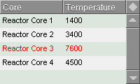
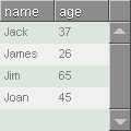
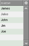
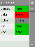

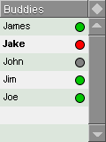
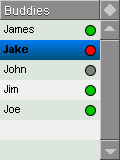
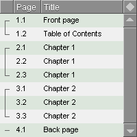
focus-column
Word
The edit field face in focus.
edit-index
Integer
The index of the edit field face in focus.
edit-value
String (can be other types as well)
The value of the edit field face in focus.
edit-field
Object
The edit field face in focus
do-action
Function
This performs an action and sets MOUSE? to FALSE.
action-name Word name of the action to do.
pre-submit-edit-func
Function
This performs the PRE-SUBMIT-EDIT-ACTION. Due to the additional bindings used by PRE-SUBMIT-EDIT-ACTION and the fact that this needs to be done in multiple places in the LIST-VIEW code, this has been assembled to a function. Only used internally.
This action is renamed from FINISH-EDIT-FUNC from version 0.0.50. It does the same, so you should rename FINISH-EDIT-FUNC to PRE-SUBMIT-EDIT-FUNC in your code.
mouse?
Flag
If true, an action was last run using the mouse. This is prevalent in the LIST-TEXT face object, where operations primarily are executed through the mouse. By using this flag, you can for example check if LIST-ACTION last was run by clicking a row, or if DO-ACTION was used to run LIST-ACTION.
keep-selected
Flag
If true, when clicking an empty row, SEL-CNT will stay untouched on the currently selected row. If set to false, SEL-CNT will be set to NONE.
Actions Priority List
The actions are performed in a specific order, so if you are using multiple different actions, sharing data, you should consult this list to see when an action is performed.
Actions in chronological order:
- LIST-ACTION
- ALT-LIST-ACTION
- DOUBLECLICK-LIST-ACTION
- EMPTY-ACTION
- ALT-EMPTY-ACTION
- DOUBLECLICK-EMPTY-ACTION
- EDIT-ACTION
- TAB-EDIT-ACTION
- PRE-SUBMIT-EDIT-ACTION
- SUBMIT-EDIT-ACTION
- REFRESH-ACTION
- OVER-ROW-ACTION
- DROP-ACTION
- SORT-ACTION
- ROW-ACTION
Optimization
LIST-VIEW offers the UPDATE? flag to let you control fully when updates should happen.
Needless to say, LIST-VIEW performs best when issuing as few updates as possible. Especially with large lists with many columns, LIST-VIEW can slow down dramatically, if excessive updating is done and that makes the GUI slow and inefficient.
Using UPDATE? to Optimize
By setting UPDATE? to TRUE, the list is updated normally on every time you need to do some simple operations like APPEND-ROW a single time.
Example
lv/append-row/values ["Joe" admin away]However if you need more complex operations, such as sorting, appending a row and then showing the edit fields, LIST-VIEW will update the list on each of these operations:
lv/set-sorting
lv/append-row
lv/show-edit
By setting UPDATE? to FALSE, LIST-VIEW no longer updates unless you specifically issue an UPDATE.
Example
lv/update?: false
lv/set-sorting 'weight 'asc
lv/append-row
lv/show-edit
lv/update
On The Fly Changes
LIST-VIEW is very dynamic and allows you to set any attribute and then call the UPDATE function to get the list view updated, but some will require UPDATE/FORCE, otherwise the list will not update. Since /force is a little slower, I think there is merit for making a list of those values that require /force, in order to optimize for maximum performance.
Here's a list of what needs the /force refinement, when you change their values:
- COLORS/4
- FILL
- DATA-COLUMNS
- VIEWED-COLUMNS
- HEADER-COLUMNS
- FIT
- H-SCROLL
- WIDTHS
- ROW-FACE
- EDGE
List is not completed.
Focusing
LIST-VIEW focusing is not yet complete, but there are certain functions available to visually indicate which list is focused. True unfocusing is not possible yet.
focus-list
Function
This turns the select cursor to its normal green color and puts focus on the list. This function is used internally throughout LIST-VIEW.
unfocus-list
Function
This turns the select cursor gray and runs HIDE-EDIT. It does not use UNFOCUS to unfocus anything.
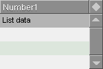
Drag'n'Drop Operations
It's now possible to rearrange the rows in a list by dragging rows around. When doing that, you alter the contents of DATA directly.
This drag'n'drop operation can be activated when REDRAGGABLE-ROWS is set to TRUE. By setting REDRAGGABLE-ROWS to TRUE, ALLOW-SORTING is forced to FALSE. This is because rearranging rows does not make sense on an already sorted list, as changes would not be displayable and there would be no way to determine where the row should be dropped.
List entries can be dragged from any row to any other row, currently only by dragging one row at a time.
Procedure
Dragging is triggered when holding down the mouse button over a row and moving the mouse 8 pixels
When dragging, a black drag marker appears and you can then move the mouse up or down in the list view to move this drag marker. It will place itself between rows.
When releasing the left mouse button, the black marker disappears and the row that was dragged, is moved to the location just below where the drag marker was.
Limitations
There are a number of limitations to this drag'n'drop method:
- Currently only one row can be dragged.
- Dragging works only properly in SINGLE-ROW select mode. There is limited operation in MULTI-ROW select mode. Other modes have not been tested.
- There is no display of the contents currently being dragged, as I haven't been able to make an efficient solution to this yet.
Drag'n'Drop Functions and Variables
redraggable-rows
Flag.
When set to TRUE, it's possible to rearrange rows in a list by using drag'n'drop.
By default this flag is FALSE.
Debugging
LIST-VIEW holds a simple debugging function.
debug-redraw
Flag
When set to TRUE, list redraws are printed to the console. This can be useful to eliminate excessive, time consuming redraws.
Example
view layout [
  li: list-view with [
    debug-redraw: true
  ]
]
Console output every time the list is redrawn:
li show 14:43:54.539
li show 14:43:56.562
li show 14:43:57.844
li show 14:43:57.954
li show 14:43:58.405
Error Handling
Not implemented yet
This is new from LIST-VIEW 0.0.4x. A wide range of errors can now be properly handled to avoid confusing errors about certain types of data which could have been entered incorrectly. This can especially be present when entering the *-COLUMNS blocks. If items are not entered correctly, it can be difficult to debug.
This makes sure that error messages are clear on what exactly went wrong. Errors are generated at the early stages of initialization and will stop LIST-VIEW from initializing, if something goes wrong.
There are no warnings in LIST-VIEW and all errors are fatal. I've attempted also to make the error messages to be really helpful rather than "overly helpful". Thus there are not many error messages, but if they weren't there, there would be a great risk of crashing LIST-VIEW at a certain point during runtime.
Error List
Not implemented yet
VIEWED-COLUMNS contains words missing from DATA-COLUMNS
EDITABLE-COLUMNS contains words missing from DATA-COLUMNS
READONLY-COLUMNS contains words missing from DATA-COLUMNS
HEADER-COLUMNS is longer than VIEWED-COLUMNS
HEADER-COLUMNS is longer than DATA-COLUMNS
Deconstructing LIST-VIEW
LIST-VIEW consists of a grouped set of faces. They are listed in the order as they are placed in the main pane of LIST-VIEW:
lst This is the list face that contains all visible rows. It can either contain iterated faces generated internally, or an iterated layout specified in ROW-FACE hdr This is the header face that contains the header buttons. It consists of the faces HDR-BTN, HDR-FILLER-BTN and HDR-CORNER-BTN edt This is the editing face, which holds all the text fields. It consists of the LIST-FIELD face. scr The scroller is currently a standard REBOL VID scroller. hscr This scroller is similar to SCR, but not yet in use. drgm Drag marker face that displays a black marker between rows, during drag'n'drop operation drg Drag face that displays the contents of the face currently being dragged. This is not finished. pup Double arrow up button meant for the scroller. This is not finished. pdn Double arrow down button meant for the scroller. This is not finished.
Beneath this level, LIST-VIEW has a few subfaces that make up the header and the edit fields.
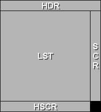
LST
Object
LST is an iterated face.
HDR
Object
HDR contains at least one header button and a header corner button, which resets sorting.
EDT
Object
EDT contains edit fields placed in the same manner as the cells for a single row in the list.
SCR
Object
SCR is currently a standard VID scroller with a few modifications, that suit LIST-VIEW better. For example, the normal way of determining the position in the list is replaced with a better method to calculate the position of the scrollbar from the current SEL-CNT versus list size.
Thanks
Thanks must go to all the people on the AltME REBOL3 world who have helped me so far!
